Dedicated to my video producer, favorite redhead, and the loveliest witch I’ve ever known
My Ginger
This story starts at the end of another, in a 1950’s, high-style modern movie. After months apart, Kim Novak and Jimmy Stewart ponder the disputed origins of their broken romance. Upon the realization that the experience changed Miss Novak—she lost her supernatural powers—the couple fall into a passionate embrace. Once again, Mr. Stewart’s blue eyes dance with excitement, their exaggerated brightness thanks in part to Technicolor voodoo.
Woven through these intimate moments are his words: “The story is, it [her loss of power] only happens if you fall in love. It’s been happening to me too, kiddo. Ever since I walked in here. Only it’s real this time. Or has it been real all along?” His final question puts a twist on the whole movie, and proposes a romantic yet thoughtful query: “Who’s to say what magic is?”
“Who’s to say what magic is?”
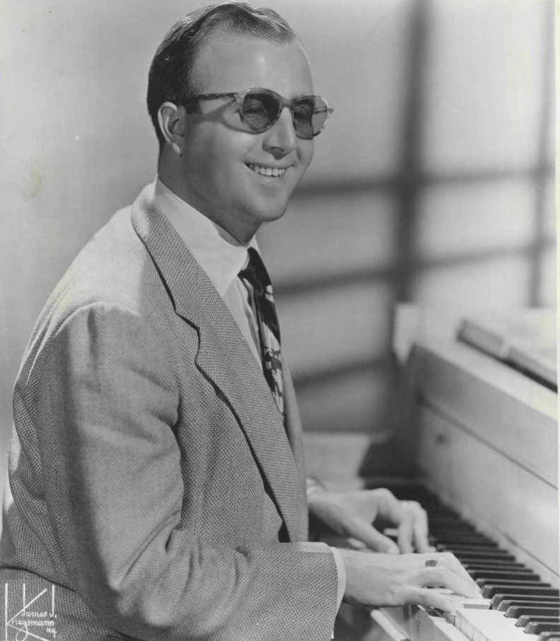
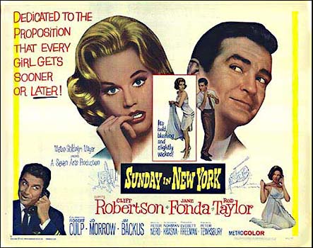
After his thoroughly enjoyable performance in this 1958 film, Bell, Book and Candle, I decided it was only polite to give him a considerate, period appropriate answer to that last, lingering question about magic. So I turned the question over to a gentleman who was at the top of his game that year, an icon and entertainer who professes to completely understand feminine sorcery. I gave it to a crooner whose blue eyes required no Technicolor enhancement, Mr. Frank Sinatra.
Sinatra’s response to the question comes in the form of a song, which was recorded a year prior to our movie, in 1957. His song, appropriately titled “Witchcraft”, clearly lays out the defining elements of that seductive, womanly magic. Frank lists several features, and I pulled out six that seem to be reasonably easy to identify.
Fingers in his hair
A sly, come-hither stare
Makes him defenseless
Creates intense heat
Stirs his heart
Is a Nice witch
But why should we reserve our magic analysis to only Kim Novak’s portrayal of Gillian Holroyd? Let’s collect a handful of fictitious, mid-century witches portrayed on screen and put them all on trial. Will they adhere to Sinatra’s definition of modern witchery? I’d love to hear Frank say, “Yeah, that broad’s a witch.”
Witch: Glinda, the Good Witch of the North
Actress: Billie Burke
Screen: The Wizard of Oz – a movie
Year: 1939
Genre: Fantasy/Musical
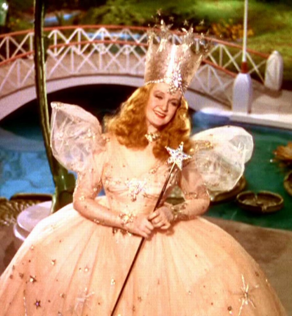
For goodness sake.
“Only bad witches are ugly.”
~Glinda
A lot of fun gets poked at Glinda. There is a belief that she tells Dorothy near the end of the film that, all along, she had the power to return home. By merely clicking her heels together and thinking, “there’s no place like home,” Dorothy could escape the lush beauty and excitement of Munchkinland and Oz, and return to her dreary dirt farm in Kansas. As a former Kansas farm girl, I’m telling you, I’d think twice about that return trip.
Glinda has been ridiculed for keeping this knowledge from Dorothy, and many bloggers and vloggers even go so far as to suggest Glinda is actually a bad witch, by not being truthful with Dorothy and by exposing her to unnecessary harm.
But listen closely to Glinda’s words in her final scene. She tells Dorothy that she only had the power to return home after she discovered why her heart wanted to go there. Dorothy undertook the yellow brick road journey—a difficult and challenging one—in order to appreciate what she had been separated from. Glinda put her on that path instead of waving her wand and sending her home, and that act of charity over the simplicity of magic makes Glinda a beautiful witch, inside and out.
That same beauty renders the Wicked Witch of the West defenseless against Glinda. To help Dorothy, Glinda magically transfers the ruby red slippers from the feet of the dead Wicked Witch of the East to Dorothy. The Wicked Witch of the West has no moral issues about using her power to get whatever she wants (the slippers), yet she’s reduced to threatening Dorothy and her innocent dog, instead of using witchcraft to remove them and be on her way.
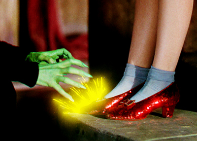
“I’ll get you, my pretty, and your little dog, too!”
Glinda’s true power springs from her sense of charity. Whether its source is witchcraft or a passion for goodness, Sinatra would be defenseless to condemn her for the gift she gives Dorothy: an understanding of the magic within her own heart.
“Oh…rubbish. You have no power here. Be gone before somebody drops a house on you, too.”
~Glinda
Witch: Jennifer
Actress: Veronica Lake
Screen: I Married a Witch – a movie
Year: 1942
Genre: Fantasy/Romance/Comedy
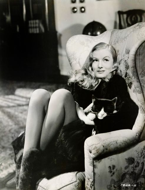
Steamy with a touch of mink.
“It would be nice to have lips to whisper lies. Lips to kiss a man and make him suffer.”
-Jennifer
The old adage—where there’s smoke there’s fire—fits this witch to a T. She’s introduced as a whisper of smoke, after having been burned at the stake in 1690s Massachusetts. Jennifer and her father Daniel are denounced as witches and caught up in the Salem witch trials hysteria.
In 1941, another form of intense heat, a lightning bolt, zaps the Oak tree that has been restraining Jennifer and her father outside of Salem for over two hundred years. A large branch breaks and releases their spirits, which again take the form of smoke. But it takes a fire in the Pilgrim Hotel, started by her warlock father, to transform Jennifer’s smokin’ body to one that’s intensely hot. By intensely hot, I’m referring to that of the sizzling Veronica Lake, the actress portraying Jennifer.
The story repeatedly presents us with blazes in fireplaces, sometimes so Jennifer can talk to her father (he needs fire to turn into a body) or so she can create a magical love potion. Not surprising, the steamy love potion she concocts is drank by the wrong person, with the sparks of love cast in reverse of their intentions.
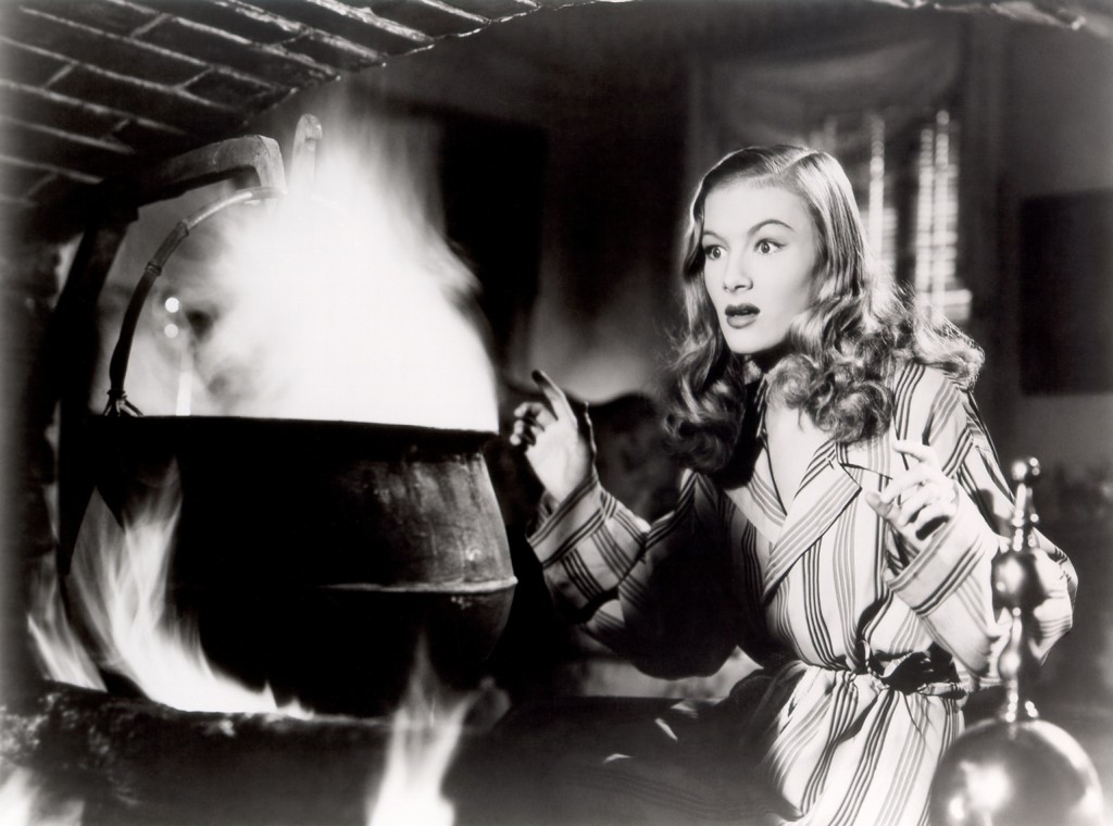
Brewing Love Potions 101
There’s no doubt in Sinatra’s mind that Jennifer is a thoroughly modern witch. Her sophistication and charm burn up the silver screen.
“Love is stronger than witchcraft.”
~Jennifer
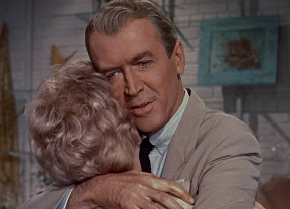
Witch: Gillian Holroyd
Actress: Kim Novak
Screen: Bell, Book & Candle – a movie
Year: 1958
Genre: Fantasy/Drama
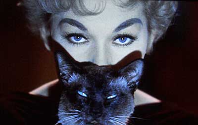
Double stare.
“I wish you wouldn’t stare at me so.”
~Gillian
Kim Novak’s eyes are mystic—a light shade of green that renders observers spellbound. How fitting for her to play Gillian Holroyd, a mid-century New York witch who may or may not have cast a love spell using an iconic, seductive stare. The image of Gillian with her face partially shielded by her familiar—a cat named Pyewacket—has evolved as a representation of the entire film. Gillian’s soft green eyes above Pyewacket’s bright blue eyes creates a mesmerizing sight, an echo of sorcery fused with an inescapable tune.
Gillian hums a seductive variation of the theme song while the cat purrs, both sets of eyes solidly fixed on an unsuspecting gentleman, Shep Henderson. Then, through either magic or Technicolor trickery, Gillian’s eyes begin to mirror the cat’s and turn to a bright blue. The results of her long, intense stare? Did she cast a spell? It’s never really clear, buts Gillian’s artful attempt has kept me entranced with this film, many times over.
Shep: Have you been engaging in un-American activities?
Gillian: I would say very American…Early American.
Witch: Samantha Stephens
Actress: Elizabeth Montgomery
Screen: Bewitched – Television Series
Years: 1964 – 1972
Genre: Situation Comedy
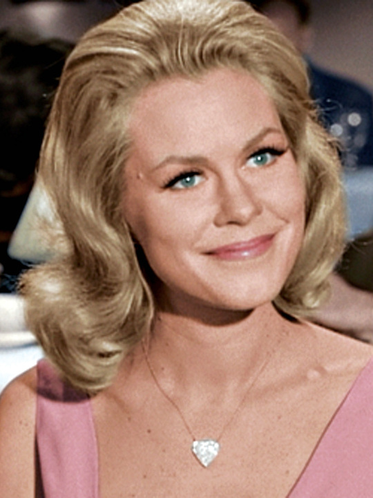
That smile!
“I’ll be the best wife a man ever had.”
~ Samantha
She means it. You can tell by the warmth of her ever gleaming smile. Samantha Stephens is lovely yet practical, the picture perfect housewife, ever friendly neighbor, charming and affectionate wife, dotting mother… Oh, did I mention she’s a witch? Nothing about her really says, “witch”, except of course, the way she twitches her nose and situations magically change.
But everything about her says, “nice.” In the pilot episode, Samantha promises to give up witchcraft—a birthright that makes everyday life easier—for the happiness of her new husband, Darrin. Arguably, her self sacrifice is the true definition of love.
Upon returning from their honeymoon, Darrin’s overly affectionate ex-girlfriend, Sheila, invites the newlyweds over to her lavish home for a get-together. Sheila’s cover story is that she wants Samantha to meet the “the gang.” Apparently it’s not obvious to Darrin, but we recognize her jealousy and vengeance brewing when she extends the invitation.
At the party, Sam is tricked, humiliated and embarrassed, yet she remains gracious and kind far longer than reasonable. It’s not until Shelia is sinking her claws into Darrin that Sam, with the sweetest of smiles, intervenes with a bit of effective witchcraft. Yes, even class acts have their limits. And it kinda makes me wonder, “who was the real witch in this scene?”
There’s no nicer witch than Samantha Stephens. Sinatra knows it, and so do we. She didn’t use witchcraft to win Darrin’s heart, a trick our previous two witches attempted to employ. With genuine affection, Samantha rounds out the mid-century era of witches with beauty, kindness, and the purest romance.
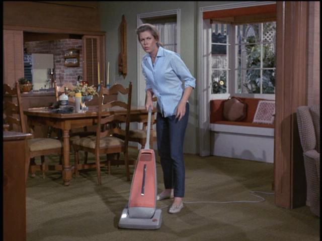
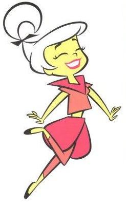
Would an old-fashioned witch vacuum? Heck no. Sam is as modern as they come.
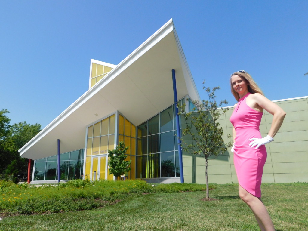
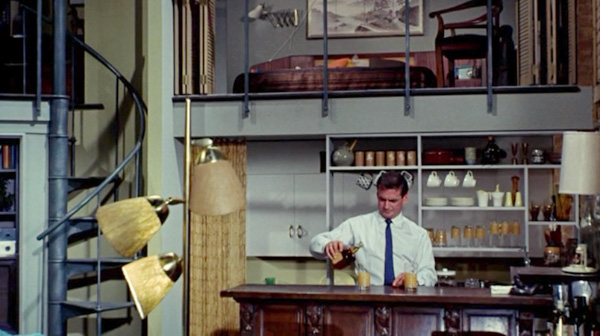
The mid-century modern witch, at least as portrayed on film, casts off the centuries old, stereotypical, haggard appearance for a clean, sleek, polished elegance. No surprise, as that look defines mid-century modern style. And her heart, at least how it’s represented at the post climax point when we say goodbye to her on film, is lovely. It’s light and refreshing, like the gin and tonic Sinatra holds in his hand. It’s soft and warm, draped across Frank’s back, like the delicate arms of his favorite, sultry, mid-century witch.
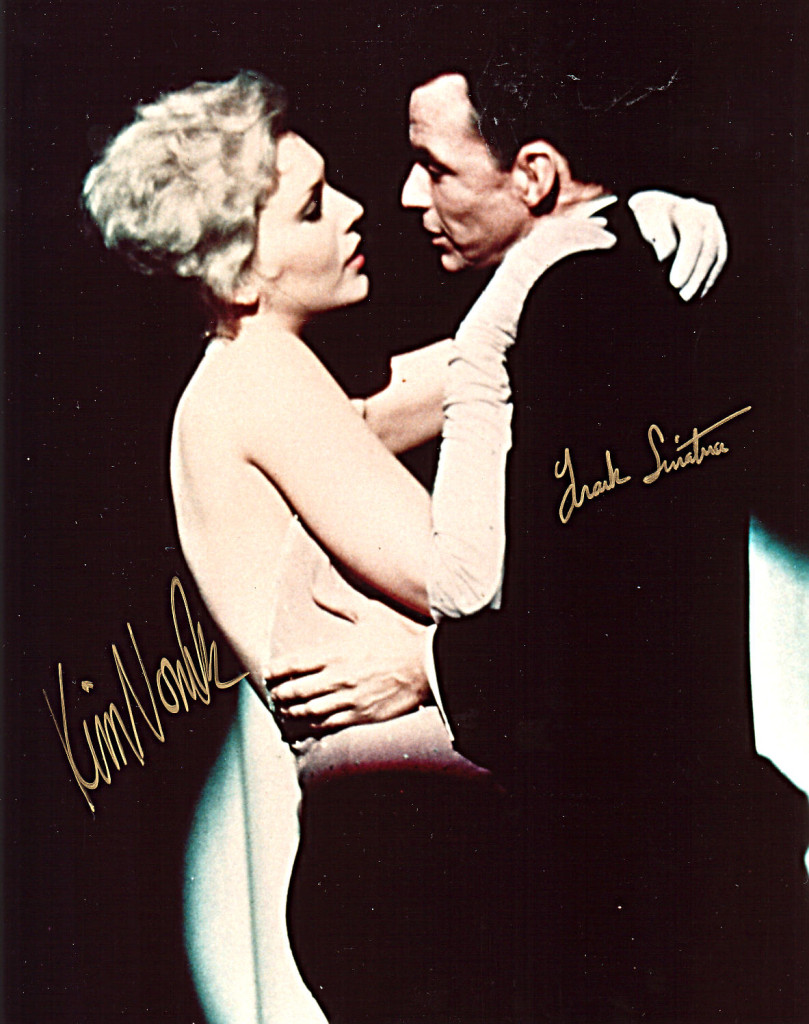
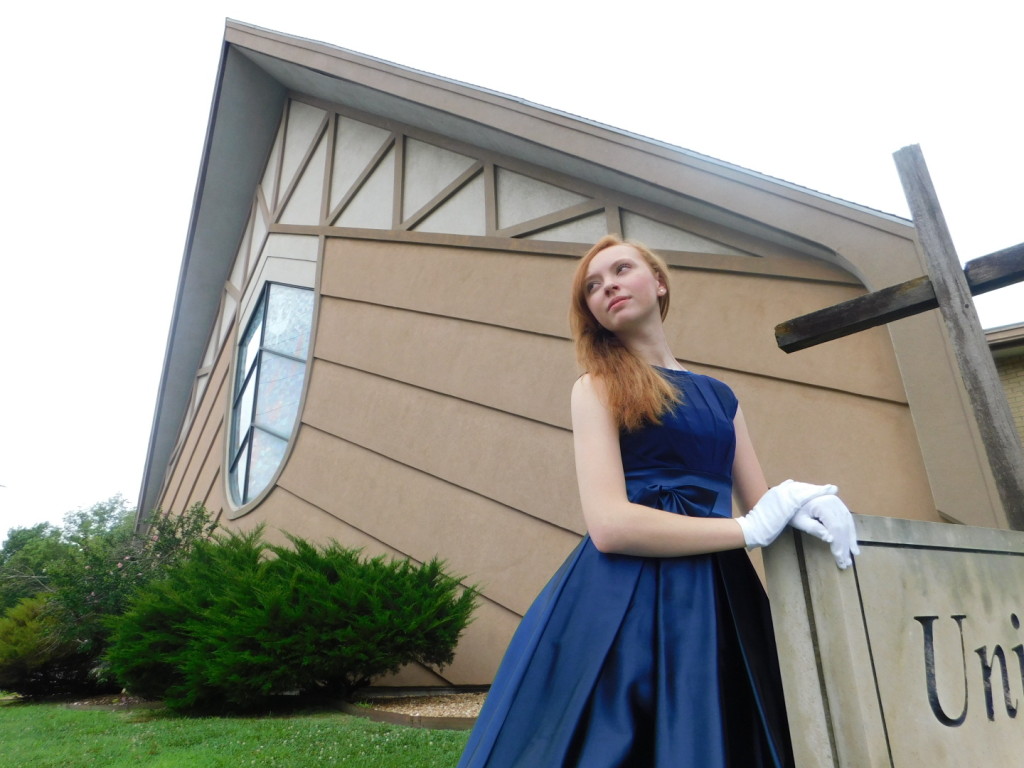
Frank with Kim Novak. Man, that witch can stare!