Molded Aluminum and Grandmas: What Every Mid-Century Modern Enthusiast Should Know and Love


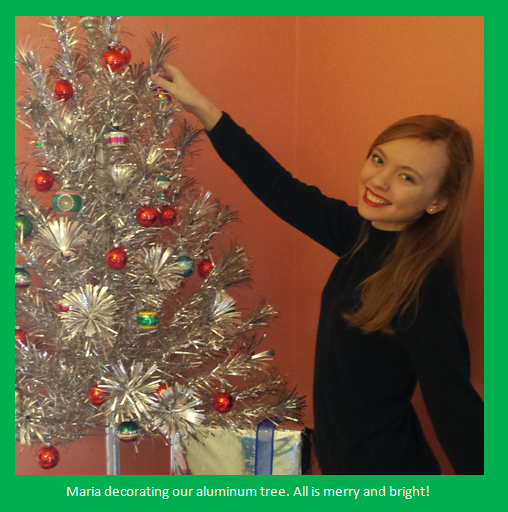
For Jeffrey Ray. May your birthday be lavished in blessings and joy.

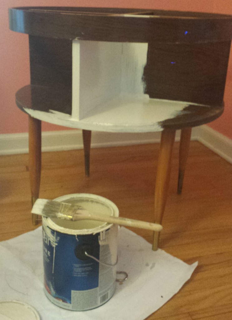
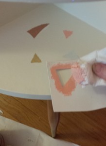
I painted this mint triangle to repair the damage on the cabinets caused by the microwave vent.
Note the West Bend Pantry Ware to the left, my Grandma Cochran’s apron to the right,
and an awesome Tiki Tea Towel on the stove by Nathanael Smith (nathanaelrosssmith.com).

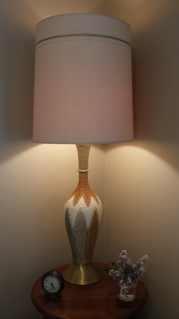
My kitchen has a recurring décor theme: mint green triangles that mimic chevrons.
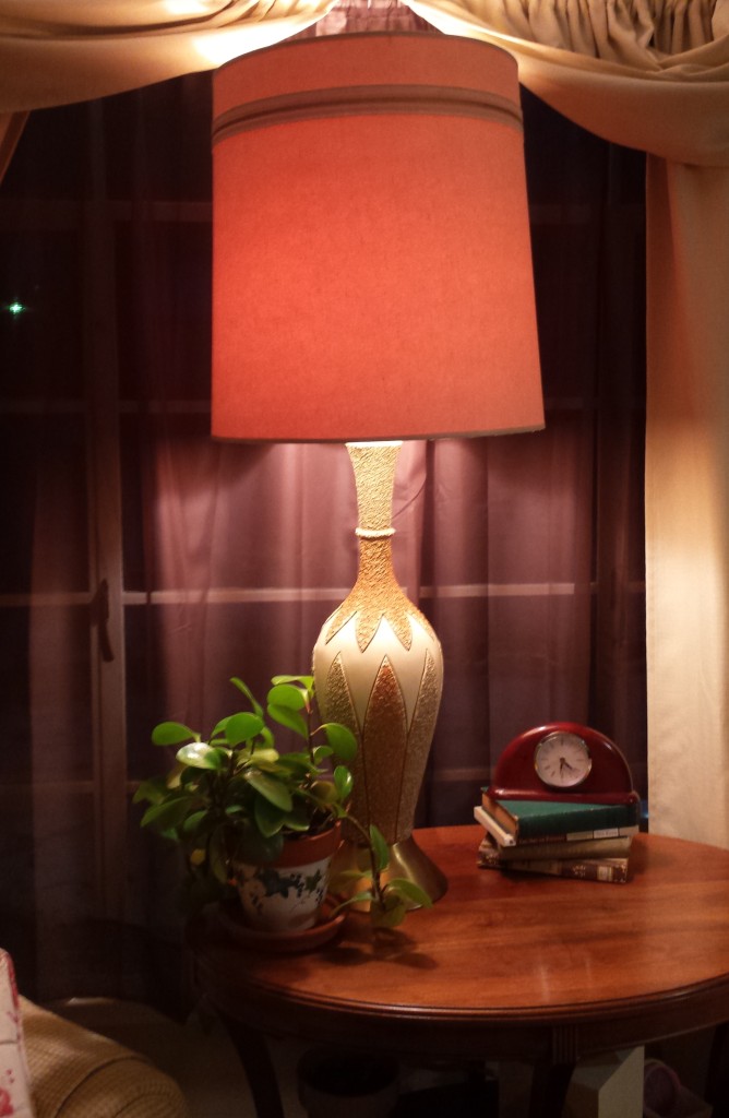
My home has a recurring style theme: everything mid-century.
My heart has a recurring nostalgia theme: memories imprinted there by my grandmothers.
Recently, as my life took an exhilarating new turn, these three themes unexpectedly collided, and I wondered if this was more than coincidence.

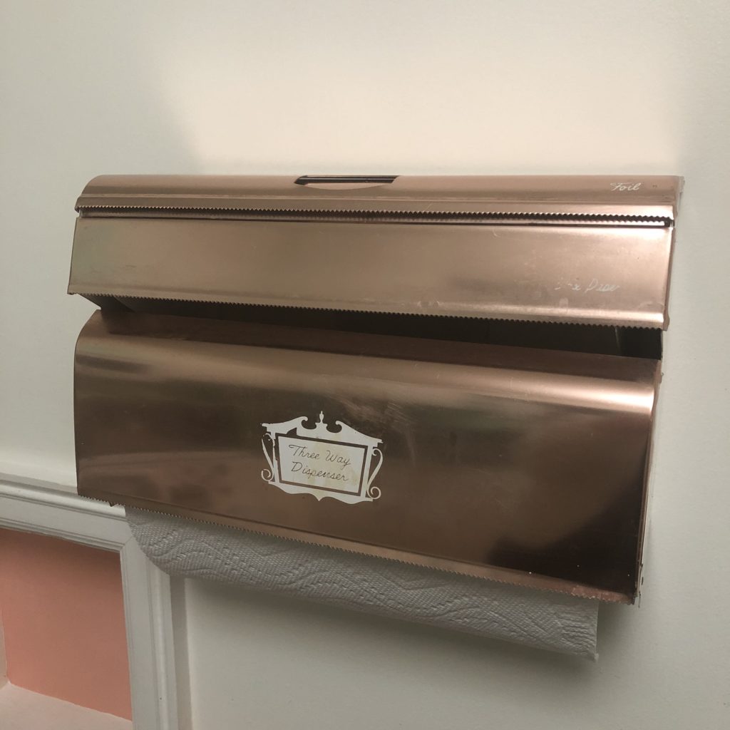
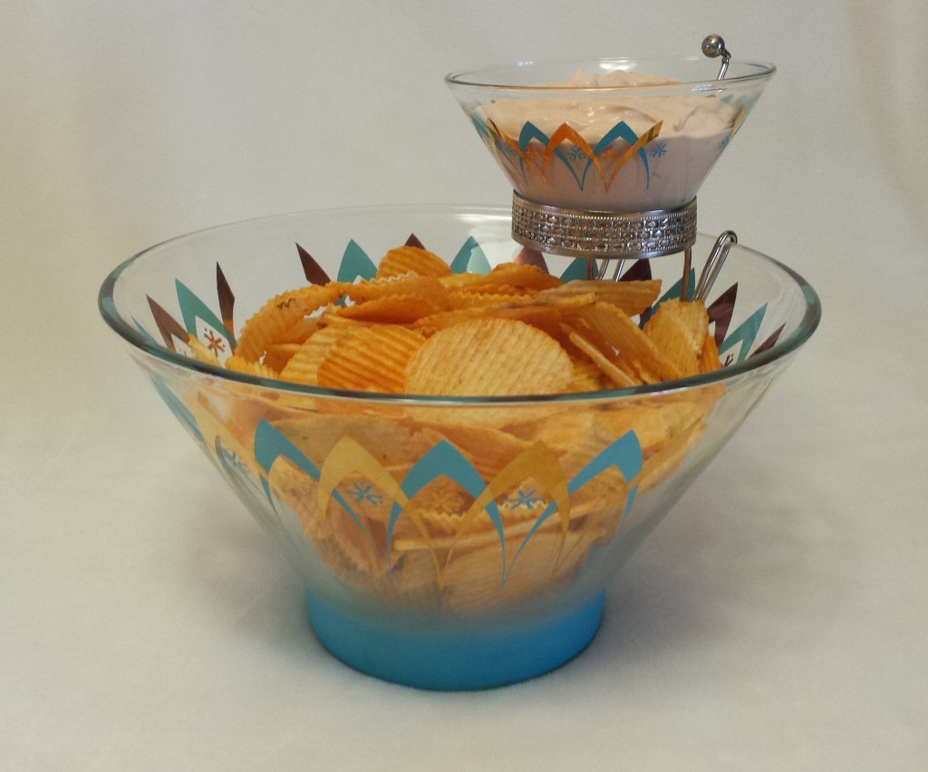
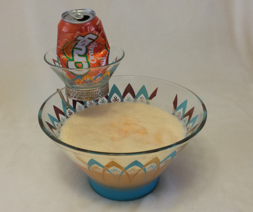
Grandma Cochran’s West Bend Three Way Dispenser

The second blog I posted on my website in October 2015 was devoted to West Bend Pantry Ware, molded aluminum accessories with a copper-colored finish. Pantry Ware was manufactured in the 1950s and 60s and takes on a range of kitchen container needs, from canisters to salt and pepper shakers to cake chests. I inherited most of my Pantry Ware from my Grandma Cochran and added pieces as I found them on eBay and in thrift shops. The piece I have memories of her using was the Three Way Dispenser (foil, wax paper, and paper towels), as it was attached to her kitchen wall from the day I was born until I removed it and took it home after her death.

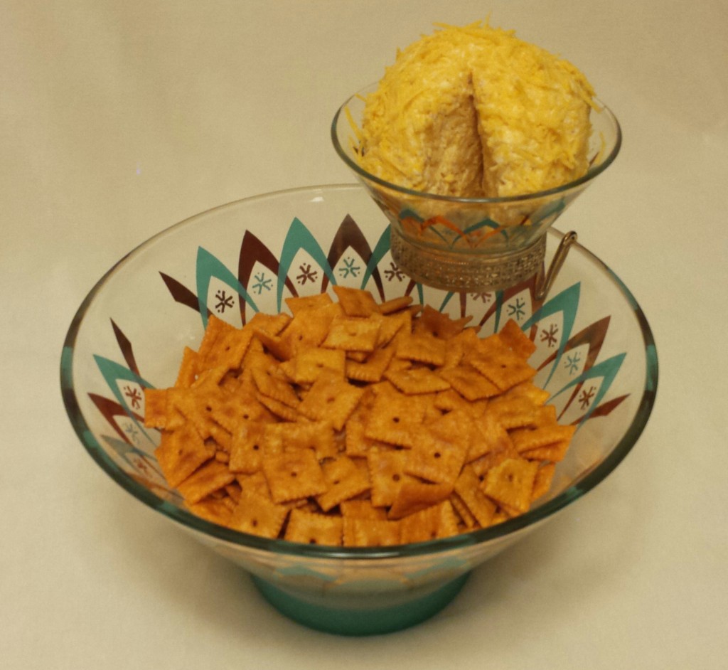
West Bend wasn’t the only company molding aluminum in the mid-twentieth century. Mirro produced lovely canisters, cookie cutters, and Jell-O molds, also in a copper finish. Interestingly, however, no Mirro items were found in my grandmother’s estate, and I have no memory of her possessing any. The mid-century gods, who have blessed me with riches beyond belief in recent years, must have decided it was time and took my life in a lovely new direction late last fall.

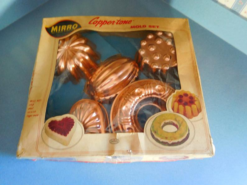
Mirro Copper-Tone Mold Set

The day after Thanksgiving a beautiful woman who set up her home in the 1950s and ’60s passed from this world. Exactly a week later I met her grandson. Unexpectedly, about a month after that, her three Mirro Jell-O molds landed in my hands. Delighted, I contemplated how to incorporate them into my kitchen and realized I now had two unique sets of molded aluminum from two unique grandmothers. I felt so blessed.

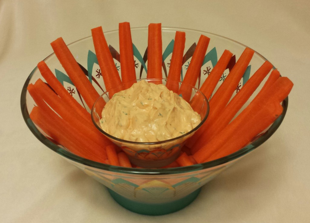
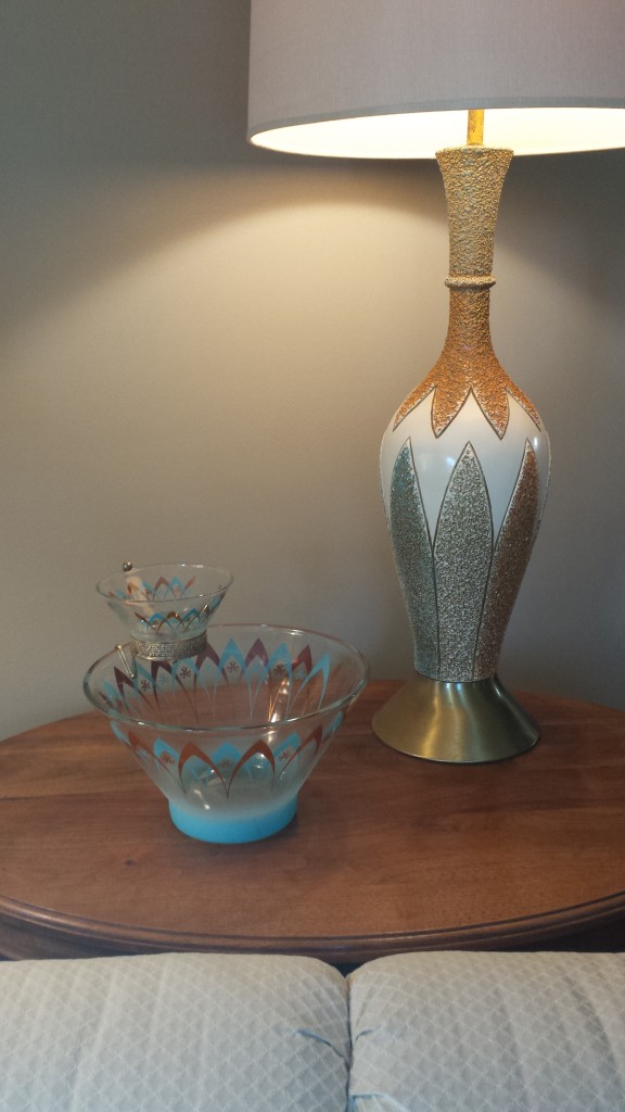
Adding another mint triangle in my kitchen was the obvious strategy to showcase the new aluminum pieces, and, fortunately, I had one lingering blank wall to do this upon. But I wasn’t satisfied with merely hanging the molds. They hadn’t survived sixty years to only be viewed as wall art—I wanted to use them! Since February was approaching, the obvious first piece to try was the heart.

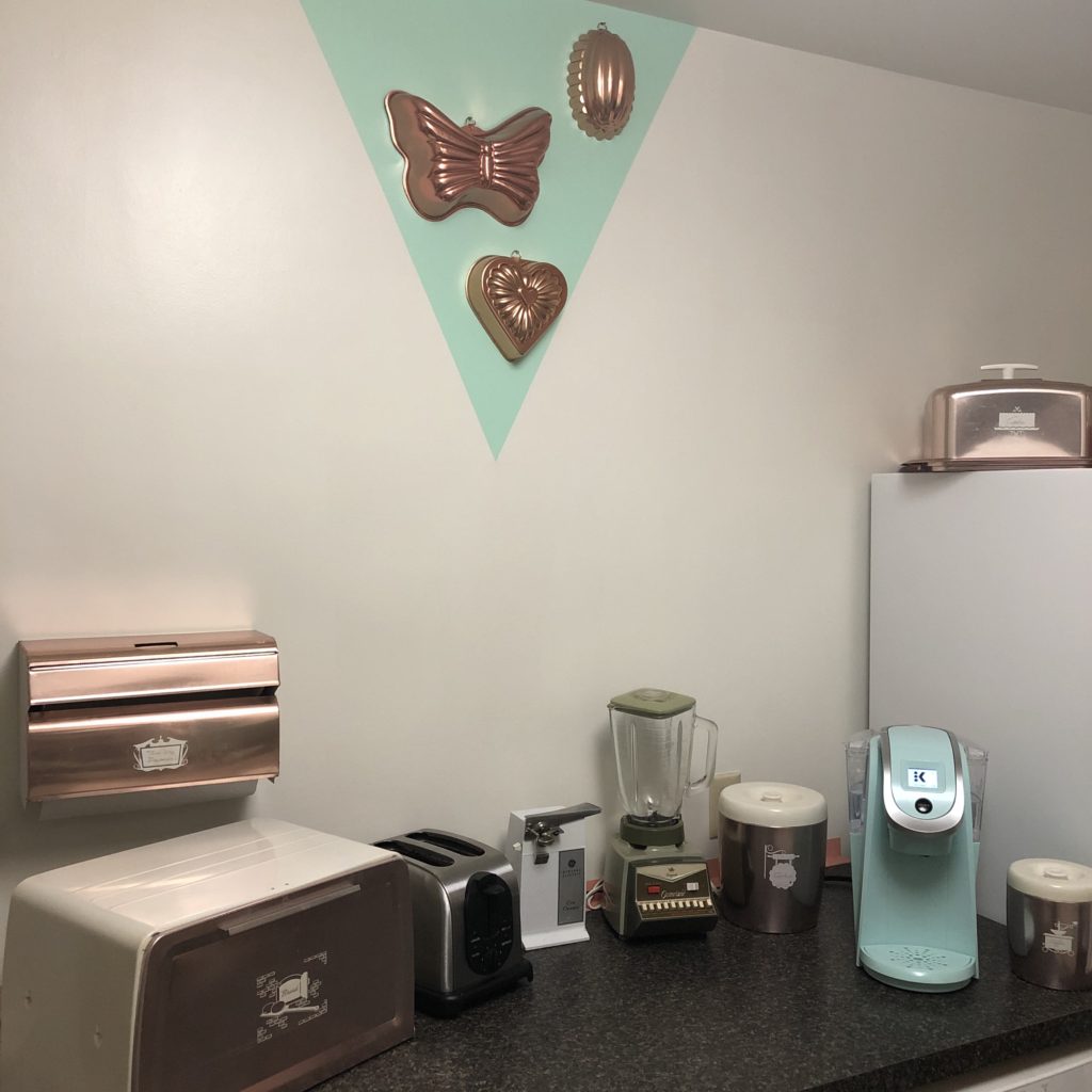
The Mirro and West Bend pieces blend harmoniously at the Atomic Cape Cod.

I’ll never forget the last time I saw Grandma Cochran. I hugged her goodbye, not knowing I was a few days pregnant. She died a couple of months later, and my beautiful daughter was born that next February, on Valentine’s Day. I always felt like my grandmother passed herself on to my unborn child with that last hug and in effect gave me one of the loves of my life as she proceeded to Heaven.

So it’s not a stretch for me to believe that another grandmother—one I’d never met—also brought me a magnificent gift as she was passing to Heaven. Once again love manifested itself as a child of February, but this time as a fully-grown man. Then, remarkably, she made sure I received another physical icon of love and February—her Mirro aluminum heart.

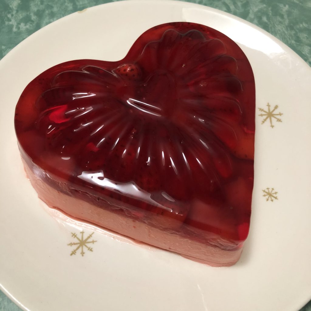
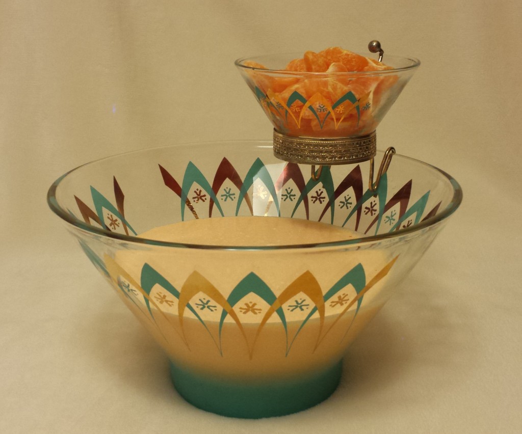
My first molded Jell-O salad—a February delight!

Grandmothers give us incredible love and wonderful memories while they are in this world with us. When they pass they often leave behind their most cherished items. Sometimes we cling to those objects, thinking we’ll never receive anything again from these ladies who are so special to us. But wisdom has taught me that love transcends all, and grandmothers newly arrived in Heaven, who clearly have earned the good favor of God, are probably granted one miracle. How lucky am I to have received at least two of these beautiful miracles, two sweet, February babes.

Metal Chairs of Summer

The Gentleman Savage

She smiles with her lips

Wet with rum

They’re tinted red

The war paint of choice

The gentleman watches them part

The savage sucks them dry


She senses with her ears

Adorned with pearls

They hear bongo drums and strings

And water crashing upon itself over rough, native stones

The gentleman speaks flowery words

The savage grunts his language of desire


She hunts with her eyes

Sparkling against the dried grass

They flash at the aesthetic delights

In their own shade of green

The gentleman studies their subtlest glint

The savage plants himself in their reflection


She prays with her mind

To the gods of virtue, and the gods of lust

The escape to paradise captivates her

But she lingers in anticipation in the dark

The gentleman brought her here

But the savage is near

Who will carry her home?

Who will capture her trust?


What’s so perfect about this metal chair, table, and umbrella combination—the entire image actually—is its utter imperfection. It is so crazy unauthentic! The table is pre-WWII and was originally all white as far as I can tell. The chairs, probably made by two different companies (Flanders and Warmack), definitely after the war, both came out of the factory in a shade of green. I’d date the umbrella to around 1960, and a previous owner cut off all its glorious, dangling fringe. Yet, I cobbled these pieces together, cleaned, sanded, repainted, and created something that never was before, in hopes of creating the aesthetic of kitschy, mid-century Tiki. And the more I delve into my research of what Tiki was, the more I believe I’ve done exactly that.

Pre-WWII metal table–maker unknown.

Ernest Gantt, who later renamed himself Donn Beach, sparked the mid-century Tiki craze during the depression. Donn collected items—flotsam, jetsam, nets, fish lamps, shells, etc.—in the late 1920s during his youthful travels to the Caribbean, the South Pacific, and beyond. After he ran out of money (his college fund to be precise), Donn returned to American and bootlegged for a bit. In 1933 he transplanted his accumulated treasures into a vacated tailor’s shop in Hollywood, establishing The Beachcomber Café, the birthplace of American Tiki. Interestingly, the soon-to-be hotspot for Hollywood elite (Chaplin, Crawford, Astaire, and Dietrich to name a few) contained not a single Tiki; California artists injected the namesake Polynesian idol into the movement years later.


A post-WWII Flanders or Warmack.


What Donn’s did have in the early days, and became most noted for, were his “Rhum Rhapsodies,”—secret-ingredient cocktails purely concocted in Donn’s imagination and his backroom bar.

The beauty of Donn’s tropical escape, which was more raw and earthy than the other black-tie, paradise-themed nightclubs of the day, is the unification of beach “trash,” newly invented rum drinks, a casual atmosphere, and an ancient theme, essentially, a version of paradise created solely in one man’s mind. Arguably, he crafted an authentic, desirous ideal from the most inauthentic ingredients. But everyone was too busy having a good time to care.

It’s said the American Tiki craze—the kitschy, alcohol infused, bamboo and palm, Hawaiian, orchestral tribal tune, mid-century escape—peeked around 1960 and died in the early ’70s. The coming-of-age baby boomers wanted their own scene.

I’d argue the raw, stripped-down, barebones desire of Tiki will never die. It can’t. It’s em

bedded deep in our DNA. The more humans evolve and progress the wider the inevitable gap from our instincts. We’ve created a complex world for the sake of complexity—to give our minds problems to solve because we’re no longer fighting to survive every minute of every day. And it’s exhausting. And stressful. And we need an escape from what was supposed to be paradise. But isn’t. Because the mortgage and the new transmission and the guy with no vocal filter in the cubical next door and the endless weekend soccer tournaments . . . these things are all overwhelming. Sometimes we want to push it all out-the-door and simply eat, drink, and mate. Do we need it? Yes. Does it sound savage? Of course. That is the promise of Tiki.

The vintage, Alice Hawaiian

dress, ceramic mug,

and patio umbrella

are the only authentic

Tiki objects in the image below.

The artist, the table and chairs.


A shout out to Don Storer at Midcenturymetalchairs.com for his ongoing research assistance.

Continue to follow The Metal Lawn Chair of the Month at AVintageChick.com

C R Kennedy


Cate, Martin. Smuggler’s Cove: Exotic Cocktails, Rum, and the Cult of Tiki. Ten Speed Press, Publisher. 2016.

The Mid-Century Clock: What Every Mid-Century Modern Enthusiast Should Know and Love

The first Starburst Clock I acquired: an Elgin, most likely produced in America.
An awesome Christmas gift.

My favorite quote is about a cuckoo clock. Only, it’s not so much about a clock. It’s more about history and climate and culture. And art. And tyrants. This quote pits oppressive virtuosity against contented mediocrity. Stolen from a combative American painter, these lines were re-crafted by an innovative actor, director, and writer with the sole purpose of filling an extra seventeen seconds of screen time. Given all that complexity, it’s fascinating Orson Welles’ unscripted, romanticized dialog in the 1949 British film, The Third Man, has become known simply as the “Cuckoo Clock Speech.”

“You know what the fellow said – in Italy, for 30 years under the Borgias, they had warfare, terror, murder and bloodshed, but they produced MichelangeloLeonardo da Vinci and the Renaissance. In Switzerland, they had brotherly love, they had five hundred years of democracy and peace – and what did that produce? The cuckoo clock.”

Breaking it down to specifics, this speech has more holes than Swiss Cheese, and has been ripped apart by historians, artists, intellectuals, and general know-it-alls, with the most argued points being:

  • The House of Borgia was prominent during the Renaissance, not preceding it
  • The Borgias reigned concurrent to the careers of Michelangelo and Leonardo da Vinci, not before. The Borgias were actually patrons of Michelangelo, while Leonardo was patronized by their arch-enemies, the Medici
  • While the Borgias flourished in Italy, Switzerland had “the most powerful and feared military force in Europe” and was not the peacefully neutral country it would later become, in the mid-eighteen hundreds
  • The Cuckoo Clock was invented in the Black of Forest of Bavaria (Germany) sometime in the seventeenth century, not in Switzerland
  • Not much came out of Switzerland during the Renaissance Era because the country was isolated and poor, with thin mountain soil and a bad climate

Despite all those pesky, nitpicky facts, I find the overall theme of Welles’ speech to be spot on. I believe after times of destitution, turmoil, atrocity, and warfare, there is a rebirth, or even explosion, of art. And its mood—pessimistic, optimistic, or, God-forbid, neutral—is irrelevant, especially if said art is in the form of say…a Cuckoo Clock. Or, if you happen to be a mid-century modern nut and prefer your clocks to burst from the center without the aid of a startling, wooden birdie.

My grandmother’s mid-century Cuckoo Clock.
A gift from my dad, straight from the Black Forest.

In the mid-1960s, my dad guarded the Berlin wall while stationed in Germany with the U.S. Army. A time of peace in the United States, I can only imagine the ongoing turmoil in East Berlin as people continued the difficult and blockaded process of recovering from a destructive war and ongoing oppression. Despite the strife he witnessed on the other side of the wall, my father returned to Kansas with a handful of souvenirs from his ancestral homeland: a small collection of Cuckoo Clocks. One he kept for himself and his future family, one he gave to his mother, and, we believe, he passed on a couple to his sisters.

I have the one he gave his mother, which hung on her living room wall for the remaining duration of her life—about forty years. Made in the mid-century and fashioned from wood, metal gears, cast iron pine cone weights, and a carved maple leave pendulum, this clock has, in effect, the exact same function as its stylistically modern cousins: to keep time.

Fifteen years before my dad snagged his German treasures, an archetype, mid-century modern clock design sprung from the minds at Nelson Associates in New York City, a thriving American metropolis never to be confused with Switzerland or the Black Forest. George Nelson’s company designed for the Howard Miller Clock Company beginning in 1947. The story of their first success in George Nelson’s words:

“And there was one night when the ball clock got developed, which was one of the really funny evenings. Noguchi came by, and Bucky Fuller came by. I’d been seeing a lot of Bucky those days, and here was Irving and here was I, and Noguchi, who can’t keep his hands off anything, you know—it is a marvelous, itchy thing he’s got—he saw we were working on clocks and he started making doodles. Then Bucky sort of brushed Isamu aside. He said, ‘This is a good way to do a clock,’ and he made some utterly absurd thing. Everybody was taking a crack at this, pushing each other aside and making scribbles.

An original George Nelson Ball Clock.
No one has gifted this to me yet (hint, hint…).

At some point we left—we were suddenly all tired, and we’d had a little bit too much to drink—and the next morning I came back, and here was this roll (of drafting paper), and Irving and I looked at it, and somewhere in this roll there was a ball clock. I don’t know to this day who cooked it up. I know it wasn’t me. It might have been Irving, but he didn’t think so…(we) both guessed that Isamu had probably done it because (he) has a genius for doing two stupid things and making something extraordinary…out of the combination…. (or) it could have been an additive thing, but, anyway, we never knew.”

Given Mr. Nelson’s story, it’s up for debate if their initial clock grew out of warfare or brotherly love (using Orson Wells’ terms). Launched in 1948, the Ball Clock picked up the name “Atomic” because it resembled the structure of an atom. Perhaps not a coincidence, its inception corresponded with the infancy the Atomic Era in design.

Evolution pushed the Ball Clock toward arguably the most iconic clock design of the modernism movement, the Sunburst, or Starburst Clock. Much more versatile in interpretation than the Ball Clock, this new design was conceived in 1949 by Nelson Associates for Howard Miller. However, this new concept literally burst into an array of materials, complexities, and compositions by designers and manufactures around the world.

A mid-century Forestville, Starburst Clock.
I picked this up as a birthday gift for a dear friend,
but now I’m having second thoughts.

This last Thanksgiving, I picked up my second Starburst Clock. I was naïve enough to ask the check-out clerk at the antique mall if it worked, or if they had a battery we could test it with. He and I both examined how the movement was attached with itty-bitty screws to the back of the clock and gave in to the obvious hassle. I purchased as is, telling myself it could surely be repaired it necessary. The next day, after a bit of research, I realized it was a wind-up clock (so that’s what the funny looking hole on the face of the clock was for…). I didn’t have a winding key, and during my investigation the glass door covering the face came unhinged, so my next stop with the clock was the neighborhood jewelry shop.

When I retrieved the clock a week later, my enthusiasm for mid-century modern design was perhaps a bit over-the-top. The clock guy saw an opportunity and asked me to follow him to the back of the shop. What sat on a dusty shelf in a dark hall by the back door caused me to gasp. After he’d satisfied himself that it kept near accurate time, I bought yet another mid-century clock, this one at a bargain price.

Dugena is a German company that bought clocks and sold them under their own name, much like a department store brand. They re-branded this particular clock which was made by Hermle, a Black Forest clock maker that rose from the ashes in Germany in 1922, shortly after WWI. Surviving the depression and the devastations of WWII, Hermle went on to thrive in the mid-century and is still going strong today, manufacturing a wide variety of clocks, movements, pendulums and dials. Not unlike a twentieth-century Michelangelo, raising from “warfare, terror, murder, and bloodshed.”

A 1965 Dugena (Hermle) mantle clock.
Modern with an Art Deco twist, this one I gifted to myself.

George Nelson, a student of architecture and an accomplished designer and writer, lent himself to a modern-day Leonardo de Vinci. Howard Miller, who put his stamp of approval on every clock Nelson’s team designed, was trained in the art and science of clock making by his father, Herman Miller, in the German Black Forest. While crafting his profound dialog, was Wells actually considering his contemporaries—modern day artists and patrons whose legacies carried on into our current century?

Historians may be satisfied with the Cuckoo Clock speech “holes” listed above, but artists, aficionados, and mid-century modern enthusiasts should demand an addendum. Although “every day” and functionally necessary in our modern world, a clock can’t be mocked for lacking significant artistic value. Considering that some of Nelson’s original clocks sold under the Miller brand are currently listed on online auction sites for thousands of dollars, it’s fair to say these objects are sought-out treasures.

Designed in America after many years of depression and warfare, and approved and marketed by a Black Forest trained patron, the modern Ball and Starburst Clocks united post oppression artistry with the true home of the Cuckoo Clock. That’s a well-crafted, lucrative twist of “brotherly love” even the Swiss would envy.

Sources:

Reddit: Ask Historians. Web. 23 Jan 2018.

https://www.reddit.com/r/AskHistorians/comments/130cv5/is_the_cuckoo_clock_speech_given_by_orson_welles/

“House of Borgia”. Wikipedia. N.p.,n.d. Web. 23 Jan 2018.

https://en.wikipedia.org/wiki/House_of_Borgia

“George Nelson (1908-1986), USA Biography and More”. N.p.,n.d. Web. 23 Jan 2018.

http://www.georgenelson.org/georgenelsonbiography.html

Joiner, Ronald. “Dugena Mantel Clock Revisited”. Antique and Vintage Clock Collecting and Repair. Web. 23 Jan 2018.

https://ronaldjoiner.wordpress.com/2017/05/07/revisiting-my-dugena-mantel-clock-yet-again-as-yogi-berra-would-have-said/

Oliver, Richard. “Franz Hermele Clock Company History”. Antique Clocks Guy. Web. 23 Jan 2018.

http://www.clockguy.com/SiteRelated/SitePages/ContactUs.html


January – Metal Lawn Chair of the Month

IMG_1666 (3)

January’s Chair – “The Empire State Building”

1925 Paris Exposition Internationale - Le Pavillon Des Galeries with a rich Art Deco facade.

1925 Paris Exposition Internationale – Le Pavillon Des Galeries with a rich Art Deco facade.

Parisian by birth, Art Deco burst onto the scene at the 1925 Exposition Internationale. He grew strong and tall, influenced by African culture, Picasso, and Bauhaus. Ridged, bold, fierce, angular…he soared to new heights, forged new industrial frontiers, and cast away the clutter of the past. Yet the architectural and design gods realized Art Deco needed a companion, so they stole an element from his being, softened it, rounded it…crafted it feminine.

Streamline Moderne possessed the sophistication of Art Deco, and the intellect, but she danced with curves and seduced with movement. Long, slender lines. Aerodynamic grace. She was truly the face that launched a thousand ships.

Gulf Filling Station in glorious Streamline Moderne.

Their youthful days were long and industrious, their nights a jazzy, café society romp. But the tides turned, and they came-of-age in the harshest of realities. The two intertwined and clung tight during the depression and the war, abandoned by their gods, sudden slaves to efficiency, practicality, and necessity.

When the dust settled and peace reigned, when breaths could sustain…linger…expand…they bore a love child, and cradled him in freedom and enthusiasm and American capitalism. He grew to be clean-lined, futuristic, and all-kinds-of “matic.” He thrived in optimism, lit the night sky with starbursts, and took the name Mid-Century Modern. And the gods were pleased.

* * *

When I found the chair. Dull, flat white paint and bits of rust.

When I found the chair. Dull, flat white paint and bits of rust.

This metal lawn chair was made by the Arvin Furniture Company in the 1940s. When I acquired it, the chair had been repainted from its factory finish in a flat, dull white. But the groves in the metal—the long, arched, lean lines—spoke to me instantly. They said, “Art Deco.” They said, “Empire State Building.” Later, the subtle lines on the side announced themselves as “Streamline Moderne,” and I realized my Empire State Building chair was fluid, not only a testament of the greatness of its own era, but a foreshadowing of exciting things to come.

* * *


Name:                                     “Empire State Building” Chair

Artistic Restoration:         Summer 2016

Manufacturer:                      Arvin Furniture Company

Product name:                     Style 27 Chair

Period:                                    1940s

The artist, the chair

The artist, the chair.


Continue to follow The Metal Lawn Chair of the Month at A Vintage Chick.com

C R Kennedy


Sources:

Chandler, Arthur. “The Art Deco Expositon”. Web. N.p.,n.d. 7 Jan 2018.

http://www.arthurchandler.com/1925-art-deco-exposition/


A Case for the Atomic Christmas Stocking: What Every Mid-Century Modern Enthusiast Should Know and Love

For the children who became known as the baby boomer generation… During civil defense drills, while you were curled up in a ball under your school desk, did you ever consider that Santa was watching?

The fear in her eyes puts tears in mine.

The fear in her eyes puts tears in mine.

As a kid I was never once instructed on how to “duck and cover” under my school desk. I guess at that point in the Cold War, during the 1970s and 80s, America’s fears had thawed regarding a nuclear weapon being launched by Soviet Russia. Or more likely, educators and the Civil Defense Administration were in a new position, caught somewhere between the perceived ridiculousness of the practice and the political fashion of the day.

Even as early as the late 1960s, America’s fears and fascinations with all things atomic had decayed. The mid-century lust for conquering space by progressing science, which went so far as to bring representations of starbursts, parabolas, and atomic symbols into our newly constructed, suburban tract homes, also fell out of fashion. This period of history, which began in 1945 with the detonation of the first nuclear bomb, became known as the Atomic Era. By 1965 its lure had peaked and was rapidly cooling.

A few months ago I realized I needed a couple Christmas stockings at my 1953 Cape Cod home, and, of course, only mid-century stockings would do. I hoped there were still a few still hanging around from the 1950s that screamed “Atomic Era.” I scoured eBay and the Internet—surely the supreme coolness and innovation of the mid-century aluminum Christmas tree spilled over into other decorative traditions of a mid-century Christmas celebration.

Apparently it hadn’t. I found nothing that satisfied my atomic craving. My enthusiasm briefly went cold, much like a hard lump of coal. Once again, I was forced to revert to what has become a perennial Plan B in my life: if you can’t find what you want, create it.

But how do you craft a nostalgic representation of something that never existed? Was it even possible? A bit of research and several attempts at the drawing board finally took me there, and I began with a visitation of why the atomic era was so “atomic.”

“Atoms for Peace” was the title of a speech delivered by President Dwight D. Eisenhower on December 8, 1953. He was addressing the UN General Assembly in New York City as part of the media campaign called “Operation Candor.” The idea, arguably propaganda, was to enlighten the American public on the risks and hopes of a nuclear future.

At first glance, I was shocked by the idea that atomic fission should be consecrated.

At first glance, I was shocked by the idea that atomic fission should be consecrated.

Not only were early Cold War Americans fearful of the Russians dropping the bomb on us, but also of what our own government might do with its powerful arsenal of nuclear weapons. Eisenhower’s plan was not only to manage the emotions of the America public but to evoke the containment strategy against Russia—to stop the expansion of communism. The scenario reminds me of Uncle Ben’s often-quoted line to Peter Parker in the Spider-Man movie: “With great power comes great responsibility.”

Eisenhower hoped to squelch national fears and reassure its citizens of a scientifically progressive yet militarily level-headed U.S. government. Atomic energy—the result of nuclear fission—was to be used for good, not evil. Convincing the Russians to do the same was an obvious diplomatic mission. Sustainability of the human race and any chance for lasting peace depended on it.

Mid-century design for peace…The preoccupation and alarm of atomic energy and its manifestations drove the post-war culture, but not only to build fallout shelters and practice air raid drills. In a mid-century paradox, the atomic symbol and its scientific cousins wove themselves aesthetically into the period’s design, often found in architecture, automobiles, and perhaps more abundantly, interior design.

After splitting the atom and winning a world war, America’s confidence rode high, and we were enthusiastic to conquer space. We stamped that fervor into entertainment, children’s toys, and the basic elements of our lives—the simple yet essential components of our homes. Mathematic and scientific representations such as parabolas, starbursts, and amoebas were incorporated into the look and construction of interior design enhancing futuristic and progressive flare.

The atomic symbol fit neatly into the evolving mid-century style, easily found in the form of wall clocks and light fixtures, and less obviously in the slender, arching, metal legs on tables and chairs. Those thin geometric lines, appropriately known as a “sensitive line,” gave furniture the appearance of gravity defiance.

Seven-Up ad featuring the Butterfly chair. The sensitive lines (the chair’s metal legs) resemble the atomic symbol.

Seven-Up ad featuring the Butterfly chair. The sensitive lines (the chair’s metal legs) resemble the atomic symbol.

According to Thomas Hine in Populuxe, the theme for the period was dynamism and fragmentation. The scientific, industrial, artistic, and economic systems exploded in post-war America. As a result, people moved out from the city core and created their own small sanctuaries in the suburbs. Bringing symbols of the atom into these new homes—their isolated space for refuge and peace—seems a contradiction. To lounge in a chair with atomic shaped legs and glance at your atomic clock, while only mere feet from your bomb shelter—an arguable necessity due to fears of atomic weaponry—is a fascinating mid-century paradox.

Santa for peace…A sleek, linear Santa Claus made a bold appearance in atomic era design. He jetted across Christmas cards in rockets and spacecraft, propelling American faith that we could get there, too. He carried his traditional optimism in the modern craft of his choice, and still toted an array of presents, even though the American landscape for materialism had vastly changed.

By the 1950s he was firmly established in American culture and acting as a convenient conduit for the exploding post-war phenomena of consumerism. Could there ever be a better advertising spokesman for frivolous consumption than Santa? The era of economic boom, mass production, and constant upgrades for progress used Santa as a well-suited vehicle to promotion and push products out of the suburban retail stores and under the manufactured aluminum Christmas tree.

Santa was all over the scene in mid-century America—appearing in pre-holiday parades, on Christmas cards, in newspaper advertising inserts, on mugs filled with hot chocolate, in seasonal yard art…not to mention in department stores, where Santa could cleverly ask an innocent child what he or she desired as a Christmas gift. How often was that object within proximity of Mommy and conveniently located near a cash register?

A three-year-old on Santa’s lap in a Virginia Department store, circa 1961.
The child appears to be a bit fearful as to his status regarding The Naughty and Nice List.

This cynical view of Santa is merely a portion of his complex and long career. His rich history includes fourteenth-century accounts of teachers dressing as St. Nicholas on December 6th and using a birch rod to beat the children who failed academically that year, while rewarding successful children with sweets or pocket money.

A much kinder mid-twentieth century Santa continued to analyze the behavior and enforce discipline upon children. The 1934 song, “Santa Claus is Coming to Town,” enjoyed its most popular versions in 1951 recorded by Perry Como and 1953 by Gene Autry. Listeners were reminded: “He’s making a list and checking it twice, Gonna find out who’s naughty and nice.”

Santa’s mid-century career mirrors that of another 1950’s global power and icon, if you will. He’s acting much like Eisenhower, who hoped to advance industry, keep the peace, and promote responsibility. Santa, similarly, is balancing the desires to produce and distribute material goods with the need to keep people, mostly little people, accountable for their actions.

Santa had a lot to juggle in post-war America.

Believing for peace… Last week my fourteen-year-old daughter nervously approached me and told me she had something important to tell me. Several scenarios quickly ran through my head, none of them comfortable conversation topics. But what she professed I had long been ready to combat, with a reply that was sincere in my heart and ironclad. She wanted me to know that she knew Santa wasn’t real, and I didn’t have to get her any gifts from Santa. I sensed her confession was less out of blossoming maturity, and more from economic concerns—she wanted to save her mother a buck. I appreciated that.

No way is this beautiful two-year-old going to grow up and stop believing in Santa.

No way is this beautiful two-year-old going to grow up and stop believing in Santa.

Unfazed, I held firm to my position. My response had nothing to do with me trying to cling to my baby’s innocence and everything to do with a ridged personal stance. I didn’t hesitate to tell her I still believed in Santa, and my advice to her was to never stop believing. She probably internally rolled her eyes at me, but I hope I at least planted a seed in her strong-willed mind.

I really do believe in Santa Claus. For all that Santa has represented over the centuries, to me his strongest attribute is the sense of hope and calm he casts during what has become a frantic and stressful season. Santa grounds us in the foundation of Christmas, in charity and sacrifice, which is the pure definition of love.

So Santa Claus, an undeniable mid-century icon, became the foundation for my atomic stocking. Many of the images of him from the era, mostly on Christmas cards, depict him holding up a tall stack of wrapped packages. It’s as if during that time in history he was considered to be carrying a heavy load.

Mid-century Santa Christmas card

Mid-century Santa Christmas card

As my mind struggled with exactly what Santa should be doing, and debated if holding up packages had any mid-century significance, those packages began to weightlessly swirl over his head, as if he were juggling them. Perhaps they simply defied gravity.

Although I couldn’t find the perfect stocking on eBay, I did manage to score McCall’s stocking pattern #2271 from 1958, which I think lent authenticity to the cut of mine. Besides Santa and his inventory of presents, I also mixed into my design period-appropriate motifs and a handful of mid-century colors, including pink, gray, and sky blue. If I can get the back of the stocking sewed on before Christmas Eve, Santa and I can continue our long-standing contractual agreement.

I don’t know how many times the little boy from Virginia pictured above had to “duck and cover” under his school desk, but I’m pretty sure he never hung a Christmas stocking with sensitive lines depicting the atomic symbol or which fashioned an inscription of his name. Somewhere in his youth, however, he perfected the talent of comedic timing, as he told me this joke as I was wrapping up this blog. Why should you never trust atoms? Because they make up everything. Apparently they do make up everything, even contemporary depictions of non-existent, mid-century, atomic Christmas stockings.

Promoting economic expansion through consumerism while incentivizing scientific responsibility in our world leaders is a big job, but leave it to Santa Claus to juggle it effortlessly.


Sources:

“Atoms for Peace”. Wikipedia. N.p.,n.d. Web. 22 Dec 2016.

<https://en.wikipedia.org/wiki/Atoms_for_Peace>

Moxie, M. “Atomic Age Design: Beauty and the Bomb”. Retropedia: A Look at Style and Design Through Time. 23 Jan 2013. Web. December 2016.

Philpott, Sarah. “St Nicholas: Naughty or Nice?”. The History Vault. N.p.,n.d. Web. 22 Dec 2016.

<http://www.thehistoryvault.co.uk/st-nicholas-naughty-or-nice/>

<http://revivalvintagestudio.blogspot.com/2013/01/mid-century-design-in-atomic-age-beauty.html>

Hine, Thomas. Populuxe. Alfred A. Knopf, Publisher. 1986.

Dumpster Diving and Judy Jetson: What Every Mid-Century Modern Enthusiast Should Know and Love

Long, slender legs. Blonde. It was love at first sight. I eyed those lean legs sticking up out of the ginormous dumpster, and what could I do? I had to go in after her. So I scaled the side of the rusty, seven-foot tall dumpster, and, with my tip toes balancing on a thin metal brace, I reached in, grabbed a leg, and pulled Judy out. Much to my disappointment, the rest of Judy was not so…appealing. But I’m no snob. I tossed Judy into my backseat and drove home, satisfied I’d saved another mid-century modern side table from a grisly death.

Judy sat in my screened-in porch for many months. She had no table top (it was possibly left shattered in the bottom of the dumpster), so I placed part of an old, exterior split door on her, sort of as a temporary, make-shift top. For a while I sat drinks or garden tools on her, trying to determine how to fix her up. I liked the idea of keeping her on the porch—she was a good size for that space, and I figured her style was well suited as a companion to my metal lawn chairs.

Her “body” was particle board with a plastic coated, fake, wood grained veneer, so I was confident the extremities wouldn’t harm it. But those legs…thin, golden, solid wood—maple or birch I guessed—I knew moisture and extreme temperatures would eventually take their toll on her four limbs and very modern brass ferrules. So as I accumulated more metal lawn chairs and fret over how to store them, my fears for Judy’s legs gave in, and I relegated her to the garage. I felt terrible.

In late June I was rearranging furniture in my living room, and a spot opened up next to a mid-century sofa which is—I swear—only a temporary part of my collection. But the sofa wasn’t so useful without an end table. While relaxing on the 1950’s sofa, guests need somewhere to sit their martinis, right? So I mentally searched all the tables in the house, until I remembered poor Judy in the garage. Unfortunately, she was a wreck.

It was a Saturday morning and the kids were on a canoeing/camping trip, so I afforded myself some “crazy Mom time” to re-analyze my treasure. I pulled Judy out of the garage and wiped the dust off.  Unfortunately, a long strip of her veneer had pulled away and needed re-glued and clamped for twenty-four hours. While being forced to halt my creative energies, I took that time to considered how to redefine her body, and cleaned-up and applied a golden stain to her worn legs. It took nicely.

Poor Judy. Weathered legs, peeling veneer, no top. She had such awesome modern styling with deteriorating and ugly surfaces. But I had no doubts!

Poor Judy. Weathered legs, peeling veneer, no top. She had such awesome modern styling with deteriorating and ugly surfaces. But I had no doubts!

The next afternoon I pessimistically released the clamp from Judy’s side, relieved to discover the glue held. Her cute mid-section was so unique, with four rounded, triangular cubbies underneath the missing table top. But the plastic coated, dark wood grained, laminated veneer was unattractive and clashed with her golden legs. The styling was fun, practical—very mid-century modern, but it was so ugly I’d couldn’t imagine sitting anything pretty or interesting on it.

The only solution…paint. I was kind of experimenting with a taupe and cream look on the living room walls, and since the table would sit against the taupe color, I thought I’d try cream paint. Also, the cream is light, fresh, and clean—a neutral that would not overpower the golden blonde legs but compliment their warmth. In the first moments of applying the paint I knew Judy was going to be more beautiful than ever.

Immediately I knew the cream paint would take Judy out-of-this world!

Immediately I knew the cream paint would take Judy out-of-this world!

However, while I was painting, the artist in me realized that this piece needed some pop—a little “Punch” for my Judy. So I considered color accents, such as painting the surface quadrants an alternating turquoise and coral. Although those colors are quintessential to the atomic era in which this table originated, when I imagined this paint scheme the results leaned to a piece of furniture better suited to a baby nursery, not a living room.

But the idea of coral lingered in my head. And to be honest, while I cleaned her up I imagined my silver aluminum Christmas tree perch on top of her. Also, given that her golden brass ferrules cleaned up so well, my mind started to play with metallics and the coral, somehow mixed about.

About a week before I started this project, a friend commented on a skirt I was wearing. I took a close look at the details of its tiny print and realized they were little triangles turned in all directions. My mind immediately flashed to a mid-century image, and I replied, “It’s my George Jetson skirt.” I was referring to the introductory scene of The Jetson’s when the earth explodes into a jazzy, abstract, array of dancing, multicolored triangles.

This brief sliver of animated television history is classic, mid-century, abstract art juxtaposed with classic, mid-century, swinging jazz. Think Paul Rand meets Frank Sinatra. Donna Mibus meets Michael Bublé. Neil Fujita meets Dave Brubeck…oh, wait, that one’s been done. Anyway, this all too short moment of TV nostalgia is a consummate spark of mid-century modern pizzazz. And it’s forever burned on my brain.

Courtesy CartoonsIntros

The same week that I discovered my skirt mimicked the Jetson’s animation, a friend of mine posted a sweet image of Judy Jetson on Instagram. Sadly, it was a thoughtful tribute regarding the death of the woman who voiced Judy Jetson, Janet Waldo. These two references continued to dance about in the back of my mind for quite some time.

When I seriously focused in on how to incorporated a coral color into my table, the entire Jetson’s party sprang to the forefront of my thoughts, and there was Judy, decked out in the cutest coral and pink, 1960’s, futuristic getup. Suddenly, everything aligned and was right in my world. This was the point when my blonde, leggy table secured her name—Judy.


Fresh, fun, flirty, and decked-out in pink and coral, Judy Jetson was a mid-century delight.

Fresh, fun, flirty, and decked-out in pink and coral, Judy Jetson was a mid-century delight.

So I examined the triangular Jetson’s image on YouTube, stuck with the metallic color contrasts idea, made four triangular stencils, and sponged on the paint. It was a bit of quick and dirty fun.

Cutting stencils from thin cardboard.

Cutting stencils from thin cardboard.

Stenciling on the triangles.

Stenciling on the triangles.

Last problem: Judy still had no top…as in, no table top. Just for fun, I cut a piece of heavy cardboard to fit perfectly inside the rounded top part of the body, because there was a lip there and it just made sense. I spray painted this new make-shift top gold, thinking it would make for a nice contrast, giving three gold layers to the piece:  the ferrules, the triangles on the nook surfaces, and the top.

With a mock gold painted top. Interesting, but blocks the downward view of the triangles.

With a mock gold painted top. Interesting, but it blocks the downward view of the triangles.

It looked okay, but this solution for a top cast shadows down on Judy’s triangles. Only one thing made sense at this point: glass. I painted the edges of the cross braces gold and a thin strip around the top ring gold to maintain the three layered consistency,  and had a piece of glass cut to fit inside the lip. At $40, this was my only real monetary investment in the piece.

Complete with glass top.

Presenting Judy…complete with glass top.

One last thought…Did you notice how my table resembles the buildings in the Jetson’s intro video above? Large, round, layered structures held up by long, thin posts (legs)? Kind of seals the deal, doesn’t it. I love it when everything falls together. Just like how my mid-century aluminum Christmas looks smashin’ on my mid-century end table which was inspired by a mid-century cartoon character.

As I suspected and hoped--a lovely stand for the aluminum Christmas tree.

As I suspected and hoped. Judy is a lovely stand for the aluminum Christmas tree.


Googie: What Every Mid-Century Modern Enthusiast Should Know and Love

To John Lautner, for relentlessly pursing his vision and fighting for his craft.

Driving down the road of life in your 1960 Plymouth Fury, you feel like you have everything you need: cash in your wallet, your sweetheart by your side, possibly a couple kiddos in the backseat. But this is the atomic era—the economy is bustling, consumerism is the rule, and deep down, you want more…because you know you can have it.

“More” is in abundance in mid-century America. It’s everywhere you turn—on your television, in your neighbor’s house, his carport, his backyard…and you want it. You’re human. So you’re driving, searching, trying to make the best decision as to where to exchange that cash in your wallet for the products you want, because you glance to your sweetheart…and she’s worth it.

This is where ad man Don Draper comes in, because he has multiple sweethearts, and they—as a whole—are worth a lot to him, too. In order to lavish upon his collective sweethearts what they want, he first has to convince you to do the same.

Is this tale about capitalism? Absolutely, in a fantastical, romantically spun fashion. It’s also about Americanism. Our culture of a free market economy with purchasing choices and opportunities for commercial improvement or decline is undeniable. And, although you may not be familiar with the term, this tale is about Googie—an extreme, often audacious, architectural  style with the raw function of provoking a quick decision to exchange goods or services for dollars.

By bringing Mr. Draper into the story I’m not suggesting Googie was a creation of Madison Avenue. I’m simply defining it as advertising, which, at its most basic, functional level, it is. The purpose of Googie was to grab your attention and quickly convince you to turn the steering wheel of your Plymouth Fury into a convenient parking lot. However, Googie was not formulated at an ad man’s conference table, but rather an architect’s drafting table.

“Googie” (pronounced ‘goo-gee) was the family nickname for Lillian K. Burton, the wife of entrepreneur, Mortimer C. Burton.  In 1949 Mr. Burton erected a coffee shop in West Hollywood on Sunset Boulevard and honored his wife by naming the establishment Googie’s.

One day in the early 1950s, architecture critic and magazine editor Douglas Haskell, and architectural photographer Julius Shulman, were driving along Sunset Boulevard. Upon spying Mortimer Burton’s coffee shop, Haskell demanded the car be stopped, then proclaimed, “This is Googie architecture.” An article with that as the title, written by Haskell, ran in the February 1952 issue of House and Home.

Haskell made no attempts to hide his ambivalence regarding the emerging style. “It starts off on the level like any other building,” he wrote. “But suddenly it breaks for the sky. The bright red roof of cellular steel decking suddenly tilts upward as if swung on a hinge, and the whole building goes up with it like a rocket ramp. But there is another building next door. So the flight stops as suddenly as it began.”

The architect of Googie’s coffee shop, John Lautner, was not mentioned in this specific article by Haskell. Lautner was a student of famed architect Frank Lloyd Wright, and followed Wright’s ideals of functionality and innovation, grounded in the organic. In the mid 1940s, before Lautner designed Googie’s, he designed three Coffee Dan’s, coffee shops all located in Southern California. His work gave birth to the Coffee Shop Modern Style, incorporating “the eye-catching roofline, the integrated sign pylon, [and] the destruction of the distinctions between indoors and out.”

In “Googie Redux: Ultramodern Roadside Architecture,” Alan Hess explains that the Coffee Dan’s designs display “Lautner’s combination of structure, space, and function. To Lautner, human predilection, not structural requirement, should shape a space. The cantilevers, structural bents, and concrete shells made possible by modern engineering free him from having to fit humans into the boxlike rooms created by conventional building methods. He selected the vaults and glass walls and trusses and angles of his buildings to help him shape the concepts of space he favored. This uncompromising attitude made him one of the true purists, sweating out the design to the last detail to preserve the consistent idea.”

Form following function…

Midcentury America hosted the merging of fresh, enthusiastic ideas with exciting innovations. Prevalent and affordable automobiles steered the culture, fueling the desire for suburban tract housing and shopping centers. Returning war veterans were eager to start families, to retool wartime factories for domestic progression, and to push the American dream onward. Peacetime enthusiasm had everyone looking to the future and to space. Everything was forward and upward. And sometimes even at a diagonal.

The new challenge for businesses was that consumers weren’t walking on sidewalks peering up at merchant names on store fronts or gazing into their windows. Inside, shoppers whizzed by in their cars, distracted by other automobiles and pedestrians. Businesses had to attract buyer’s attentions from a block away and clinch it. The solution was for advertising and building structure to become big and loud and flamboyant. Additionally, it had to speak the language of the day, and that language was futuristic…space.

Rockets, amoebas, boomerangs, chevrons, starbursts, and atomic models, not to mention bold geometric shapes and angles and vivid color…this was the cultural dialect of post war America—the atomic era. American business quickly learned to speak this emerging language, and created some fun and unprecedented art as a byproduct.

Googie is better shown than described. After all, the purpose was for it to first catch the eye, then excite the mind. So I’m displaying several examples, all from my hometown of Topeka, Kansas. Even though the style was rooted and prevalent in Southern California, architectural examples of the atomic era are sprinkled all across American. How fortunate we are that some pieces are being used and maintained, time capsules of the American vision of the future, over fifty years ago.


Auto Acceptance Center, 29th Street. The folded plate captures the eye and draws it upward.

Auto Acceptance Center, 29th Street. The folded plate roof captures the eye and draws it upward.


Alorica, 29th Street. Originally a Katz Drug Store, I really dig how the blue underside of the folded plate roof accents its zig zag.

Alorica, 29th Street. Originally a Katz Drug Store, I really dig how the blue underside of the folded plate roof accents its zig zag.


Bobo's Drive In, 10th Street. A Topeka Classic since 1948, their red neon signs and wall of glass are period Googie, and their shakes are delicious!

Bobo’s Drive In, 10th Street. A Topeka Classic since 1948, their red neon signs and wall of glass are period Googie, and their shakes are delicious!


The Gage Center sign off Huntoon and Gage Boulevard is 100% Googie. Large, bold, colorful--wildly geometric including a slender chevron. One of my favorite architectural pieces in Topeka.

The Gage Center sign off Huntoon Street and Gage Boulevard is 100% Googie. Large, bold, colorful–wildly geometric including a slender chevron. One of my favorite architectural pieces in Topeka.


Gage Bowl, Huntoon Street. The zigzag of the folded plate roof appear to float above the entry.

Gage Bowl, Huntoon Street. The zigzag of the folded plate roof appears to float above the entry.


Soon to be Mr. Nice Guys, Huntoon Street. Obviously this was a mid-century drive-in. Note the boomerang roof line over the

Soon to be Mr. Nice Guys, Huntoon Street. Obviously this was a mid-century drive-in. Note the subtle boomerang (folded) roof line above the parking spaces.


Topeka Dental Associates Building, Huntoon. Love the wavy, cantilevered roof line.

Topeka Dental Associates Building, Huntoon Street. Love the wavy, concrete shell, vaulted roofline and floor-to-ceiling glass windows.


Chief Drive In sign, 37th Street. Kudos to Wal-Mart for not only saving but preserving the glorious piece of Topeka architecture.

Chief Drive-In sign, 37th Street. Kudos to Wal-Mart for not only saving but preserving this beloved piece of Topeka architecture.


Central National Bank, Quincy, downtown. Towering stucco arches supporting a round protruding eave. Two stories of solid glass...I'd mark this structure down as Googie in my books.

Central National Bank, Quincy Street, downtown. Towering stucco arches supporting a round protruding eave. Two stories of solid glass…I’d mark this structure down as Googie in my books.


Hanover Pancake House, Kansas Avenue. In business since 1969, this sign can't be missed. Note the colorful diamonds tracing the eave.

Hanover Pancake House, Kansas Avenue. In business since 1969, this sign can’t be missed. Note the colorful diamonds tracing the building’s eave.


Spangles, Wanamaker Road. Founded in 1978, Spangles incorporates elements such as neon, bold colors, and the geometric juxtaposition. The particular restaurant was probably built around 2005, yet its heart is mid-century.

Spangles, Wanamaker Road. Founded in 1978, Spangles incorporates elements such as neon, bold colors, and geometric juxtaposition. This particular restaurant was probably built around 2005, yet its heart is mid-century.


University United Methodist Church, 17th Street. The structure angles forward as it reaches to the heavens.

University United Methodist Church, 17th Street. The structure and roofline angles forward as it reaches to the heavens.


Gage Bowl sign, Huntoon Street. Googie architecture often tilted letters about, such as "fun" was placed, above. The bowling pin bursts from the base of the sign, a common geometric element of Googie.

Gage Bowl sign, Huntoon Street. Googie architecture often tilted letters about, such as “fun” was placed, above. The bowling pin bursts from the base of the sign, a common geometric element of Googie.


Kansas Children's Discovery Center, 10th Street. This building is approximately five years old yet it screams Googie. The impressive triangular roof, supported by walls of glass and colorful poles, mimics a rocket ready to launch.

Kansas Children’s Discovery Center, 10th Street. This building is approximately five years old yet it screams Googie. The impressive triangular roof, supported by walls of glass and colorful poles, mimics a rocket ready to launch.


Did you notice this post contained a fair bit of ice cream? I’d argue that Googie is the ice cream of design—a tall, swirling, scrumptious ice cream cone. It climbs upward to the sky because no one said it couldn’t. With the aid of post war building materials—sheet glass, glass blocks, metal, plastic, stucco, wood, copper—the wafer and the ice cream merge and harmonize.

There were no rules regarding Googie materials or geometry—this cone twists, dollops, scoops, and curls in any flavor imaginable. It not only brings your eye up and out and to the diagonal but brings it deep into your imagination. You’re seeing man’s past, present and future, all at once, in a single, delicious dessert.

And what better treat for your sweetheart who’s smiling at you from the passenger seat of your Fury and the for the kiddos in the backseat than a tasty bit of ice cream.

Now that you know what Googie is, send me a pic of it from your city. Email it to crkennedy3@gmail.com or…hashtag it as #avcgoogie on social media. Make it a selfie. And have fun. Because Googie is nothing if not fun!


Ice cream makes everyone happy. So does Googie!

Ice cream makes everyone happy. So does Googie!


Sources:

Hess, Alan. Googie Redux:  Ultramodern Roadside Architecture. Chronicle Books, LLC. 2004.


Quartite Creative Corp Lamp: What Every Mid-Century Modern Enthusiast Should Know and Love

Bedroom-lamp alone

How a lamp found a home…

A few years ago I experienced a major life change that forced me into a 1953 Cape Cod home with very little furniture to sprinkle about the blond, oak floors. The tragic event wasn’t something I’d ever wanted to happen, but had to accept for the time being. So I scavenged some cheap thrift store, flea market, estate sale, and (free!) roadside finds up into a cobbled mid-century mess in my new residence. I was safe with comfortable places to sit and sleep, but definitely far from content or satisfied.

One afternoon during those early days I stopped into an antique mall that I frequented in better times. I hoped to find an affordable treasure, one with enough magic to pull all my mismatched furniture pieces together. What I found and fell in love with was a 1950s, two-tiered, walnut laminate coffee table. Unfortunately for me, it was appropriately priced at $195. So I took a risk and waited. Every couple of weeks I stopped in, hoping the table would be on sale.

About six months later I found it red tagged for $115. Ecstatic, I began clearing all the smaller decorative items off the table, because it was going home with me. I got down to the last item and took a step back. How long had that object been displayed there? In the center of the table—on the long, single stretch of its lower tier—sat a very large table lamp. I think all this time I’d been so obsessed with the table that I never noticed the beauty of this mid-century lighting piece—a 1956, Quartite Creative Corp lamp.

The two pieces—the table and lamp—were the same age (from the 1950s), and the same style (very modern), and both were designed for the living room. I imagined the couple not only originated from the same household, but from the same room in that house—the living room. They’d been functional, decorative partners for 60 years. And who was I to break up a good partnership? So for $35 I took the lamp and my $115, on-sale coffee table, and headed home to enjoy the Friday evening in true Vintage Chick style.

I immediately placed the coffee table in front of the sofa (duh!). Perfection…and in ways I hadn’t even expected. The table’s designed with a long lower tier which is open in the middle, and two short second tiers on both ends. The spaces between the lower and upper tiers are perfect for laptop storage. A pillow resides on the open part of the lower tier mimicking an ottoman. The upper tier surfaces are great for drinks, books, reading glasses, junk…you know. The table and my sofa create a second, very comfortable, writing environment.  But for all of the wonderfulness of the coffee table came struggles with its lifelong partner, the lamp.  

As I drove my mid-century acquisitions home that Friday night, I had high hopes the lamp could set on the fireplace mantle in the living room. I wanted to pull light upward in the room and accent the fireplace. Also, the builders of my Cape Cod cleverly placed an electrical outlet in the center of the mantle surface, and I really wanted to indulge in their ingenuity. Unfortunately, the space between the mantle and ceiling is 42”, and my new lamp with its original shade was 44”. Impossible fit.

20150220_182333

The Quartite on the walnut sofa table. Not bad.

I have a walnut sofa table in the living room which, by the way, looks smashing with the coffee table! The night I brought my lamp home, the sofa table was centered in the picture window next to the sofa and was partnered with a small, Frank Lloyd Wright/mission style lamp. Both pieces had come from my last residence and had been paired for about 8 years. But I split them up and placed my new lamp on the sofa table. It stayed there for a month and looked okay, but its huge lamp shade, 19” x 17”, ate up too much of the window view. So I shifted the furniture moving the sofa table east 3 1/2 feet. The lamp no longer blocked the view of my water fountain and gardens. All was fine until I discovered an affordable, depression era, art deco sofa table at a flea market.

Yeah, I bought the art deco sofa table. I reasoned with myself that I needed an entry table for my non-existent entryway. So the Quartite lamp moved to the art deco sofa table next to the front door. And the mission lamp moved back to the walnut sofa table by the window. Things were tight, but now I had a surface by the door to set down my purse and other items when I came through the front door. The arrangement was good, until I started painting the room.

I tried several test samples of color on the living room wall. Shades of gold and tan dominated in my furniture, but I hoped to eventually change out to a grey scale. I ultimately matched the paint to the grey-ish tan on the Quartite lamp. I guess I was trying so hard to make the lamp work in this room with its companion, the coffee table, that I painted the wall a color that matched the lamp. And to remind myself how well it matched, I rearranged the furniture yet again. The lamp stayed along the far wall with its new coat of paint, resting on a Heywood Wakefield side table, for awhile…


Different room, different problem

For a long time, my bedroom in this Cape Cod was pathetic. My bed sat on the floor for over a year and I had no night stand. The walls in the room were in rough shape and painted a shade of green which may have been popular for two months back in 2007. But now they looked awful.  I disliked the room so much I slept on the couch in the living room, the bedroom strictly relegated to clothing storage. Looking back, I realize the room embodied all my emotions regarding my new status in life. Deep down I didn’t want to accept that status so I avoided it. Same went for the room; it remained ugly, neglected, and unused. Until I ventured into my favorite second hand store…

Did I mention I sometimes hear vintage pieces calling to me? From outside the store?  It’s true. When they call I go in and always find a treasure. Last January I was leaving my part-time job and hesitated before I got in my car. Yes, I stood in the cold parking lot staring at a great second hand furniture and accessory store, “Once More Décor.” I finally went in and discovered a headboard I’d seen months ago suddenly half price. The headboard, definitely 1960s, and metal bed frame together were $75. I was interested but uncertain until the sales lady pulled the the headboard finials off. Without the finials the headboard’s style was a wonderful modern, art deco mix. SOLD!

I went home and started scraping, sanding, cleaning, spackling and priming those awful bedroom walls. I was excited! Invigorated! In love! And I decided to use the same paint I’d starting using in the living room, the “kind-of-grey, kind-of-tan” color, more accurately called “taupe.”

While painting late one night I needed more light to cleanly cut paint in around the trim and windows, so I snagged the Quartite lamp and sat it on the floating table with my paint can. I remember this night well—I’d been listening to “Maybe I’m Amazed” by Wings, over and over on my phone. Perhaps it was the quintessential love song in the air, or my goofy, tired, lingering enthusiasm. Regardless, in an instant I knew the lamp was destined for this room. Its taupe segments matched the new walls to a tee. Its copper segments mirrored the coppery color of the headboard. The turquoise blue in the lamp was a color I hoped to incorporate in as an accent. The poor lamp had spent over a year, not so happy, in the living room. But it needed to be in this room—in my new creation.  The partnership with the coffee table had to be dissolved, no matter how much my mind fought the idea. So the lamp stayed. In the bedroom. Ready to begin a solo journey.

Bedroom-Maria earring

A Vintage Chick needs a pretty and comfortable place to primp and relax.

Bedroom-Maria on bed

The whole point in this experience? Sometimes two objects just don’t go together anymore. After many years in aesthetic harmony, fending off cultural and style revolutions together, a friction surfaces and erodes the once vogue connection. You struggle and rearrange until you realize it just won’t work anymore. So you split the partnership, placing the objects in separate rooms, where their clashes can no longer be seen.  And after a bit, or perhaps a very long time, you conclude its okay. Happiness can be found in new environments, with new companions, and new attitudes. It’s a hard lesson in decorating, and in life. Separation from a long-time mate can really hurt, but sometimes the resistance to the split hurts more, and keeps décor—and people—from bliss and contentment in new homes.

Although my lamp is finally satisfied in its spot, I’m still not entirely content in my new home. But that’s one reason I’m writing this blog and sharing my journey. Stay tuned, folks. But be forewarned. I’m not aiming for “okay.” I’m shooting for “fabulous.”  Fun, flirtatious, mid-century, and fabulous. I can’t imagine a more fulfilling theme for the journey to my final home.

Bedroom alone

Ahhh….at last. Good night.

Anchor Hocking “Happy Hour” Chip & Dip Set: What Every Mid-Century Modern Enthusiast Should Know and Love

There is a local thrift shop I like to frequent because it’s clean and stocks a decent kitchen and glassware section. Every once in a while I find a beautiful piece of vintage Pyrex significantly below its market value. On Thursday I popped into the shop because I felt it calling to me.

As I approached the glassware shelves in the very back of the store, an item to the right, in the furniture section, caught my eye. Then it sucked me in like a long lost child, and the moment I was close enough I wrapped my arm around it. The item was mid-century, screamed “atomic modern,” and was smashingly gorgeous. But what the heck was it doing on a crappy fake wood sofa table behind a crappy 1990s blue sofa, ten feet away from the kitchen section? A better question… Who cares? It was nine bucks and it was mine!

I stood in the check-out line, clinging to my treasure. The woman behind me asked me if I knew my item was from the 1950s. I politely responded, “yes”. She informed me her and her ex-husband were glass collectors, having amassed a $10,000 collection while they were married. In her expertise, what I was holding was a punch bowl, and probably originally came with matching punch glasses. She guessed it was Federal Glass.

Her comments were fascinating, as I had first thought this set would be perfect for chips and dip. After I made my purchase I asked some of my mid-century modern Facebook friends if they could tell me anything about the set. The overwhelming response: it’s a chip and dip set. However, in the back of my mind, the seed had already been planted, and I imagined a frothy, pink or orange sherbet punch inside the larger bowl. So I went to the Internet for a bit of research.

One of the photos of the same set that was shared by a Facebook friend called the set “Blendo.” I searched Blendo and found many striking, similar pieces in a variety of colors made by the West Virginia Glass Specialty Company. There were bowl sets with the identical design and the exact same metal bracket that attached the bowls together. All the bowl sets, pitchers, and glasses under the Blendo line have the same graduated color motif starting dark and heavy at the bottom, fading to clear as it rises upward. My bowls had that feature but not to the same extent. Also, none of the pieces I examined featured the super cool atomic pattern. So I kept looking.

I took a stab and Googled “Anchor Hocking Chip and Dip”. After milling through many sets, I found a picture on Flickr. It was a set identical to mine, photographed next to its original box. I love original boxes—they don’t lie and their story doesn’t change over time. This box clearly said: Anchor Hocking “Happy Hour” Chip & Dip Set. So I was done. Or was I?

I kept thinking about the Blendo glass similarity and the fact that the Anchor Hocking and the West Virginia Glass Specialty Company brackets were identical. After a little more research I stumble upon a claim that my atomic set was made by Anchor Hocking and “decorated by West Virginia Specialty Glass Blendo.” I can’t verify that, but it’s plausible.

So what to do with my “Happy Hour” treasure? I decided something orange would look lovely behind the turquoise pattern. The more I considered orange it occurred to me that a very “orange” event would be taking place in a few days. The Denver Broncos would be playing in Super Bowl 50, and I always think of them from the old days when their defense was known as “Orange Crush”.

I threw all these ideas into a pot…I mean, a “bowl”, and came up with this theme: “A variety of ways to use the ‘Happy Hour’ Chip & Dip Set for your Broncos Super Bowl party.” Here they are…

The classic: Cheddar and Sour Cream Ruffles and Orange French Onion Dip

Chips and dip use


The unexpected: Cheez-Its and a Cheddar Cheese Ball

cheezits use


The healthy:  Carrots and Orange Dilly Veggie Dip

Carrots and dip use


The old-fashioned:  Orange Sherbet Jell-O Salad and Halos mandarins

Jell-O and oranges use


The high class/low class: Orange Crush Punch and Orange Crush

Orange Crush Punch use

Though I tried to forget about it, one question remained: why was this set placed in the furniture section of the thrift shop? Had a store employee brought it out from the back but been distracted and sat it down to assist someone? Had someone picked it up and debated about a purchase only to change their mind and discard it in the first convenient spot? My theory—the first person to bring the bowls out from inventory didn’t think of them as a kitchen item. They saw the set as art…art so beautiful that it should be displayed “as is” in the living room on a table for your guests to admire. I completely agree.

Lamp and bowl use


Recipes:

Orange French Onion Dip

16 ounces sour cream

1 packet onion soup mix

Roughly 12 drops yellow and 4 drops red food coloring


Mix all ingredients.


Cheddar Cheese Ball

¾ package (6 ounces) cream cheese, softened

2 tablespoons Dijon mustard

2 tablespoons dry sherry

2 tablespoons vegetable oil

16 ounces shredded Cheddar cheese


Beat the cream cheese in a large bowl until fluffy and soft. Stir in mustard and sherry, mixing thoroughly. Beat in most of the Cheddar cheese and vegetable oil. Shape mixture into a ball and roll in the remaining Cheddar cheese. Wrap ball in plastic and refrigerate until firm.


Orange Dilly Veggie Dip

1/4 cup chopped green onions

2 tablespoons chopped fresh dill or 2 teaspoons dried dill weed

1/8 teaspoon garlic salt

1/8 teaspoon pepper

½ cup light sour cream

¼ cup plain nonfat yogurt

Roughly 12 drops yellow and 4 drops red food coloring


In small bowl, combine all ingredients and mix well. Cover and refrigerate 1 to 2 hours to blend flavors.


Orange Sherbet Salad

2 boxes orange Jell-O

2 cups hot water

2 cups orange sherbet

2 cups Cool Whip


Mix Jell-O and hot water, stirring until Jell-O is dissolved. Add sherbet and mix well. Add Cool Whip and mix well. Chill. (As salad thickens the Jell-O sinks to the bottom of the bowl)


Orange Crush Sherbet Punch

½ gallon orange sherbet

6 ounces of frozen orange juice concentrate

1 (2 liter) bottle ginger ale

1 can Orange Crush soda


Place orange sherbet and frozen orange juice in bowl and allow to soften for 10 to 15 minutes. Mix in ginger ale. Add a splash of Orange Crush for a little extra “punch!”

The Aluminum Christmas Tree: What Every Mid-Century Modern Enthusiast Should Know and Love

1960's ad snip

The aluminum Christmas tree is to mid-century modern as the Christmas tree (in general) is to Christ; it’s a glorious representation of its time and creator.

Although tree worship is pagan in nature, the Christmas tree is anything but non-Christian. In 8th Century Germania, missionary St. Boniface cut down Donar’s oak, a tree worshiped by German pagans. He replaced it with an evergreen tree, and, in efforts to convert the pagans to Christianity, explained that the three points of the triangular shaped evergreen remind humanity of the holy trinity (God the Father, Son, and Holy Spirit). Also, unlike deciduous trees which tend to be round or oval in shape, the triangular evergreen resembles an arrow, pointing to heaven.

St. Boniface was not the first to equate the evergreen with religious or spiritual representation. An evergreen plant replaces its leaves or needles continuously over the year. Thus, the plant is always green. This natural, perpetual animation may be why the Ancient Egyptians, Chinese, and Hebrews believed that evergreen garlands and wreaths symbolized eternal life.

Bringing the tree to Christmas… In Medieval times mystery plays were preformed on December 24, the name day in some countries for Adam and Eve. The plays were presented around the paradise tree (from the Garden of Eden) which was decorated in apples (representing the forbidden fruit) and wafers (representing the Eucharist—redemption).

It is speculated that Protestant Christian reformer Martin Luther first added lighted candles to an evergreen tree in 16th century Germany. By the 18th century the custom had spread along the upper Rhineland of Germany but not in the more Roman Catholic lower Rhineland, as it was considered a protestant expression. However, around 1815, with the emigration of Prussian officials, the custom became more widespread. By the 19th century the Christmas tree had solidified itself in Germanic culture. And as Germans immigrated to America, they brought their traditions with them.

The atomic era and the space age launched during the 1950s in the United States, representing both developments in technologies and the general cultural attitude. Americans were happy to cast off the despondency of the Great Depression and the anxiety of World War II, and reel-in the excitement of economic boom and futuristic advancements.

Post war America had an extraordinary combination of factories in need of new, non-war productions; war developed technologies in need of new, domestic uses; returning soldiers ready to work and in need of jobs; and lots and lots of optimism. The possibilities were endless. The 1950s—the same remarkable decade that brought us advances that included polypropylene, the polio vaccine, and integrated circuits—gave us a new concept for one of the oldest symbols of the birth of Christ.

In 1958, Tom Gannon, toy sales manager for the Aluminum Specialty Company, was captivated by a metal tree in a store window during a visit to Chicago. He took the idea to his company engineers, in Manitowoc, Wisconsin. They developed a substantially cheaper tree—retailing for $25 compared to $85 for the tree Gannon saw in Chicago. Also, their tree was easier to mass produce, and easier for the consumer to put up and break down. Aluminum Specialty produced hundreds of thousands for the 1959 Christmas.

blonde 1960 with tree fix

At first the buying public seemed confused by this product. Artificial trees were nothing new, but, since aluminum is an excellent conductor of electricity, there is a fire danger with stringing electric lights on these trees. So the idea of casting colored light from a rotating color wheel on the tree was introduced. With this added marketing novelty, in 1960 Aluminum Specialty’s tree was branded “Everglam” and sales took off, with millions being sold during the decade. On the flip side, sales of electric light strings actually took a brief nosedive.

Other aluminum manufactures followed suite, and trees of varying heights and colors were produced, silver being most prevalent. Yes, all was merry and bright…for about ten years. Sales took a downturn in the late sixties, and, according to the general internet consensus, who was to blame? Charlie Brown.

Yes, America’s favorite blockhead takes the wrap for putting an end to an icon mid-century fad. In A Charlie Brown Christmas, Charlie Brown went against popular opinion—of Lucy and the Peanuts gang—and bought a sad little “real Christmas tree” instead of a “big, shiny aluminum tree…maybe painted pink” for the Christmas play. At first he was ridiculed for his blockhead decision.  But the pathetic little tree seemed to grow with love and warmed the hearts of the peanuts gang, and the mid-century, American consumer. Much like a shooting star, the brief sparkle of the aluminum tree faded.

The aluminum Christmas tree may have blurred into nostalgia for about forty years, but Charlie Brown’s Christmas special didn’t. Generations of children and sentimental parents kept the beloved program alive year after year. And with each replay came the question from curious, young minds and, perhaps, a few parents: “What’s an aluminum Christmas tree?”

My answer? It’s a sparkling adornment that reflects the joyous light of its environment. It’s a mid-century creation that reflects the zeal, ingenuity, and ambition of its creator. It’s a seasonal testament that reflects change, evolution, advancement…yet brings us back to the core—a reminder of our own Creator.

Maria decorating tree

I purchased my aluminum Christmas tree about a month ago off eBay for $125. It’s four foot tall, and was 100% complete, including all fifty-eight branches, paper branch sleeves for storage, stand, instructions, and original box. If you’re willing to forego any of those components, the price obviously drops. At first I was looking for one without the “pom-pom” branches, but they sort-of grew on me as I shopped, and now I’m glad I picked that feature—the pom-poms add to the uniqueness. Perhaps they are a bit of space age “pop!”

Aluminum trees have made a resurgence in recent years, following the return to popularity of the modern style of design. Aside from that general trend, I think the trees were also resurrected out of grannies’ attics by the very television program that relegated them to that dark and dusty purgatory a few decades ago. That brightly animated and beautifully scored holiday tradition—deeply entrenched in the American household for fifty years—is a TV special in which Linus reminds us that the birth of the Christ child is the reason for the season, and the Christmas tree is its most holy, enduring symbol.


Sources:

“Christmas Tree”. Wikipedia. N.p.,n.d. Web. 20 Dec 2015.

<https://en.wikipedia.org/wiki/Christmas_tree>

Williams, Tate. “The Short Life—and Awesome Resurgence—of the Aluminum Christmas Tree”. mental_floss. 24 Dec 2014. Web. 20 Dec 2015.

<http://mentalfloss.com/article/60849/short-life-and-awesome-resurgence-aluminum-christmas-tree>

“Aluminum Specialty Company (Made First Aluminum Christmas Tree) – Manitowoc, Wisconsin 1967”. Scripophily.net. N.p., n.d. Web. 20 Dec 2015.

<http://scripophily.net/alspcowi19.html>