Molded Aluminum and Grandmas: What Every Mid-Century Modern Enthusiast Should Know and Love


For Jeffrey Ray. May your birthday be lavished in blessings and joy.

I painted this mint triangle to repair the damage on the cabinets caused by the microwave vent.
Note the West Bend Pantry Ware to the left, my Grandma Cochran’s apron to the right,
and an awesome Tiki Tea Towel on the stove by Nathanael Smith (nathanaelrosssmith.com).

My kitchen has a recurring décor theme: mint green triangles that mimic chevrons.
My home has a recurring style theme: everything mid-century.
My heart has a recurring nostalgia theme: memories imprinted there by my grandmothers.
Recently, as my life took an exhilarating new turn, these three themes unexpectedly collided, and I wondered if this was more than coincidence.

Grandma Cochran’s West Bend Three Way Dispenser

The second blog I posted on my website in October 2015 was devoted to West Bend Pantry Ware, molded aluminum accessories with a copper-colored finish. Pantry Ware was manufactured in the 1950s and 60s and takes on a range of kitchen container needs, from canisters to salt and pepper shakers to cake chests. I inherited most of my Pantry Ware from my Grandma Cochran and added pieces as I found them on eBay and in thrift shops. The piece I have memories of her using was the Three Way Dispenser (foil, wax paper, and paper towels), as it was attached to her kitchen wall from the day I was born until I removed it and took it home after her death.

West Bend wasn’t the only company molding aluminum in the mid-twentieth century. Mirro produced lovely canisters, cookie cutters, and Jell-O molds, also in a copper finish. Interestingly, however, no Mirro items were found in my grandmother’s estate, and I have no memory of her possessing any. The mid-century gods, who have blessed me with riches beyond belief in recent years, must have decided it was time and took my life in a lovely new direction late last fall.
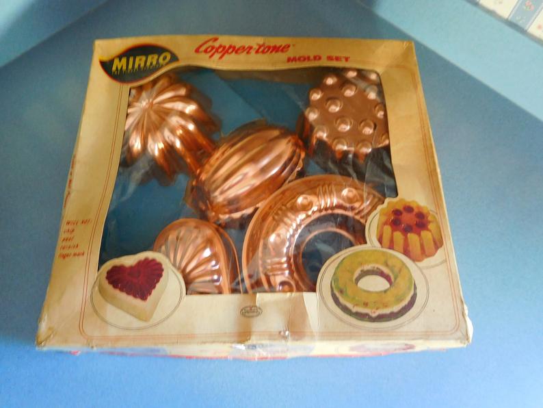
Mirro Copper-Tone Mold Set

The day after Thanksgiving a beautiful woman who set up her home in the 1950s and ’60s passed from this world. Exactly a week later I met her grandson. Unexpectedly, about a month after that, her three Mirro Jell-O molds landed in my hands. Delighted, I contemplated how to incorporate them into my kitchen and realized I now had two unique sets of molded aluminum from two unique grandmothers. I felt so blessed.

Adding another mint triangle in my kitchen was the obvious strategy to showcase the new aluminum pieces, and, fortunately, I had one lingering blank wall to do this upon. But I wasn’t satisfied with merely hanging the molds. They hadn’t survived sixty years to only be viewed as wall art—I wanted to use them! Since February was approaching, the obvious first piece to try was the heart.

The Mirro and West Bend pieces blend harmoniously at the Atomic Cape Cod.

I’ll never forget the last time I saw Grandma Cochran. I hugged her goodbye, not knowing I was a few days pregnant. She died a couple of months later, and my beautiful daughter was born that next February, on Valentine’s Day. I always felt like my grandmother passed herself on to my unborn child with that last hug and in effect gave me one of the loves of my life as she proceeded to Heaven.

So it’s not a stretch for me to believe that another grandmother—one I’d never met—also brought me a magnificent gift as she was passing to Heaven. Once again love manifested itself as a child of February, but this time as a fully-grown man. Then, remarkably, she made sure I received another physical icon of love and February—her Mirro aluminum heart.

My first molded Jell-O salad—a February delight!

Grandmothers give us incredible love and wonderful memories while they are in this world with us. When they pass they often leave behind their most cherished items. Sometimes we cling to those objects, thinking we’ll never receive anything again from these ladies who are so special to us. But wisdom has taught me that love transcends all, and grandmothers newly arrived in Heaven, who clearly have earned the good favor of God, are probably granted one miracle. How lucky am I to have received at least two of these beautiful miracles, two sweet, February babes.

Glamour Shots by the Christmas Tree: What Every Mid-Century Modern Enthusiast Should Know and Love

Looking for somewhere to plant a Christmas kiss.

My daughter is a ballerina and has been performing in the Nutcracker Ballet for about twelve years, not to mention numerous spring ballets and recitals.  Part of the required stage makeup is a generous amount of bright-red lipstick. A tradition with the dancers that seems to give them delight is what I’ll call the post-performance kiss.

Lovely ballerinas donning red lips.

After the performance, it is not uncommon or surprising to see dancers with red kiss imprints on their faces, necks, or shoulders which were placed there by a fellow dancer. Love, friendship, “thank God that’s over,” or “we nailed it!” . . . the distinct, red mark could honestly be an expression of any of these emotions or feelings. However interpreted, the lingering lipstick on your friend’s skin is proof that the action and emotion occurred, there for the world to see.

While nutcrackers and ballet are a deeply held Christmas tradition for some folks, the MCM crowd has its own flavor of Christmas conventions that often includes aluminum Christmas trees, Shiny Brite ornaments, and the magical yet often elusive color wheel. And, if you’re following any mid-century groups or hashtags on social media (you probably are if you’re reading this) you’ll be delighted by the occasional, random photo of a mid-century woman all glammed up, posing by her Christmas tree. There seem to be only about fifty or so of these photos in the social media jukebox, immortalizing these women twenty years into the current century.

The one consistency I found in these photos—the thing that pops and solidifies the element of glamour—is lipstick. Like the young ballerinas, the mid-century woman didn’t shy away from a healthy dose of lipstick when she was on her own stage—the squeaky-clean floor of her holiday home. I imagine most of these photos were taken on the enchanted evening which is Christmas Eve, either before a party or an elegant night at home with family. But don’t misinterpret, these ladies weren’t upper class, wealthy, or fashionistas. From the backdrop of their homes, many appear to be middle class. Probably housewives. But their pride in their home, their tree, and themselves shines. These ladies are their own version of Shiny Brites—polished, colorful, lovely.

Dating back 5,000 years, the history of lipstick is a pendulum of questionable alchemy and cultural controversy. Ancient Sumerian men and women were the first to invent lipstick, making it out of crushed gemstones and poisonous, white lead. Although worn by powerful women throughout history such as Cleopatra and Queen Elizabeth I, during the middle ages the church banned the practice, professing it as a deceitful, confession-worthy deed.

In the early last century, a combination of unruly suffragettes and the first Hollywood starlets reclaimed the acceptance of lipstick, and, by mid-century, lipstick was a makeup must in non-toxic, vivid shades, captured forever in the recent advancement of color photography.

Purple dress and lipstick–fantastic!

A Christmas tree has many meanings and evokes different emotions in everyone. But in the purest, most basic sense, the traditional evergreen tree symbolizes undying life and the Holy Trinity (an evergreen is naturally in the shape of a triangle). It strikes me, that these photos, which are over fifty years old and will now live into perpetuity on social media, contain uniquely decorated symbols of undying life, and perfectly applied lipstick, which surely was transferred to some else’s skin, forever leaving traces of love, friendship, or “Wow—we really nailed this tree!”


Komar, Marlen. “The History of Red Lipstick, From Ancient Egypt to Taylor Swift & Everything In Between”. Bustle. 2016


You’ve Come a Long Way, Baby: What Every Mid-Century Modern Enthusiast Should Know and Love

Smoke ’em if you got ’em. In my case, all I have is pie and hot Pyrex.

We’ve come a long way, baby. Or have we?

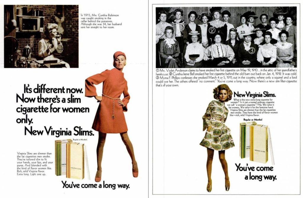
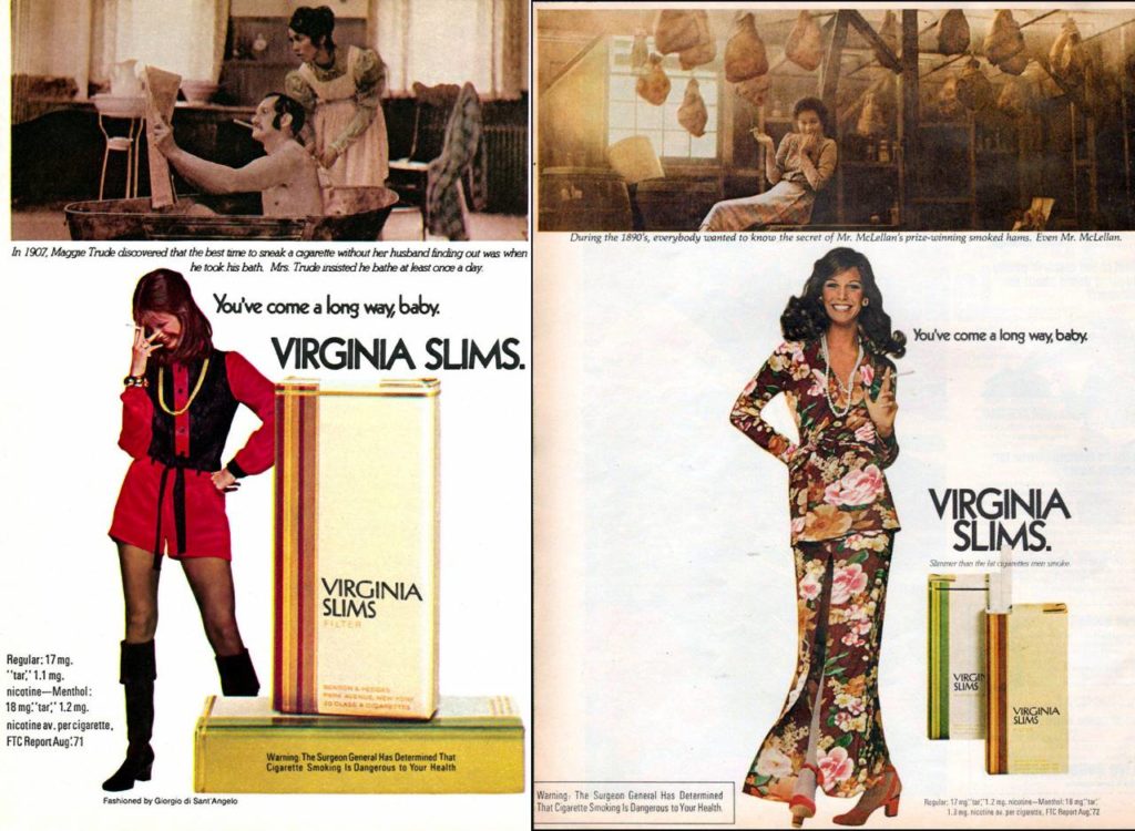
When Philip Morris hired the award-winning Leo Burnett Agency in the late 1960s to market their new line of cigarettes, Virginia Slims, the apparent intention was to piggyback off the exploding women’s liberation movement. Instead of boring you with statistical data, you’ll have to trust me—Burnett nailed it. “You’ve come a long way, baby,” became the rallying cry of the modern woman. Ads showing mostly humorous depictions of women attempting (and failing because of a male authoritarian society) to smoke in the early 1900s contrasted brilliantly with highly fashioned, 1960s-1990s models. Of course, the models gave the appearance of strong independence, often coupled with a long, slim, elegant cigarette. Obviously, the ads were designed to sell cigarettes; if they gave women a sense of empowerment, that was purely a feel-good, induced byproduct.

1968 Virginia Slims Ads

These ads are tightly woven into the fabric of my childhood memory. My grandmother operated a beauty shop, and in those days women flipped through magazines while sitting under the hairdryer. As the new, monthly periodicals hit her salon, the old issues ended up at my parent’s house. I spent a significant amount of my childhood reading women’s magazines—mostly of the domestic goddess flavor. I’m sure the advertisement on the page facing the radical Virginia Slims ad was more often than not a happy housewife, possibly showing off her new Pyrex casserole dish. You can call it a mixed message for a young, developing, female mind, but honestly, I see it as a dose of reality in the 1970s, and still today.

This duality of womanhood, planted long ago in my adolescent, girly brain, once again rears its not-so-pretty head. As I finally chose to ease out into the world of dating as a seasoned woman, I found the sexy, lean, independent, smokin’ cigarette dueling it out with the traditional, breakable, over-patterned Pyrex dish. My first steps onto the dating scene were a slap in the face—a rude awakening. See, I was buying the B.S.—“we’ve come a long way, baby.”

After dusting myself off from a few missteps, I indulged a bit in an exploding market that may be filling a tiny portion of the giant, advertising hole left by the tobacco industry—online dating coaches and advice. This industry’s general campaign is dirt in the face of the glamourous “You’ve come a long way . . . ” Here’s what the dating coaches say: “you have to attract the man,” “never chase a man, let him chase you,” “your masculine energy is great at work, but not attractive to men,” and the tidbit that pisses me off the most . . . “he’ll tell you things on a date that he doesn’t really mean. Accept it. It’s okay because men live in the moment—that’s just who they are.”

1972 Virginia Slims Ads

So what’s a strong, independent, modern woman to do? Unlike our mothers and grandmothers, we can’t even take out our frustrations by lighting up a long, slim cigarette in public—it’s unhealthy, unpopular, and unfashionable. In many cases illegal. We’re back to spending quality time with our Pyrex. I think my current dating strategy is to bake pies and set them in the window sill to cool. Hopefully, a whiff of the scent will float about the neighborhood and find its way through a cracked window and into the living room of a hungry bachelor. Will this strategy work regarding me getting a date? There’s a very slim chance. Did my grandmother try this? Probably. Have we come a long way, baby? When it comes to dating, not a chance.


Lowbrow, Yeoman. “You’ve Come A Long Way, Baby: Virginia Slims Advertising Year By Year”. Flashbak. 2016


May – Metal Chair of the Month

“The Columbine”

I found you in the garden

Weeping tears of crimson red

I asked if your heart was breaking

But with the wind, my futile words fled


So I sat with you in the garden

My eyes tracing slender, verticle veins

Five delicate spires in regal red

A crown for your perennial reign


I left you in the garden

Undisturbed, for your fate is not mine

Because beauty is not always a labor of man

More often it’s of Mother Nature’s love, and time

*  *  *

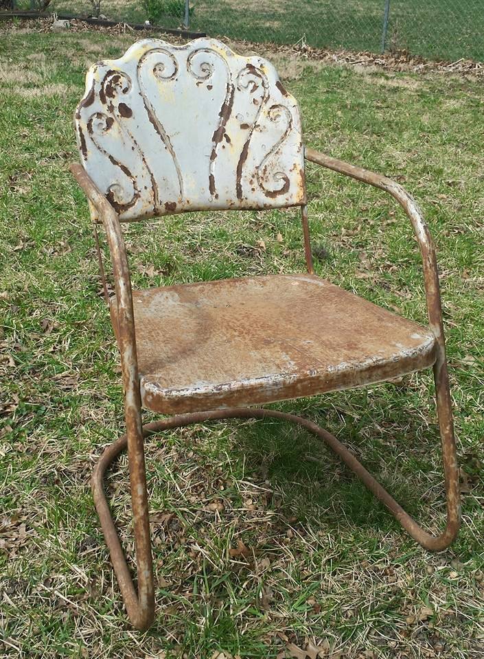
I’ve often pondered how to artistically recraft this chair, but no ideas or visions ever came to mind. The cracks in the final layer of cream paint along the verticle grooves of the seatback always intrigued me, as if they held importance. Beyond revealing what is probably the original, decades-old coating of deep, red paint, those cracks said, “Hold off on recreating. Wait for a revelation.” I waited a year and a half. It wasn’t until the crimson columbine bloomed in my garden this spring that the inherent beauty of the chair blossomed in my head. The five, slender design grooves, hinting at the red majesty of the past, mirror the five, delicate, verticle petals of one of my favorite mid-spring flowers—the columbine.

Name: The Columbine

Artistic Restoration: None as yet

Manufacturer: Cleveland Welding

Product name: Restmaster

Period: 1938 until at least WWII. Uncertain when production ended.


The artist, the chair.


A shout out to Don Storer at Midcenturymetalchairs.com for his ongoing research assistance.

Continue to follow The Metal Lawn Chair of the Month at AVintageChick.com

C R Kennedy


April – Metal Chair of the Month

“The Brunswick”

My bowling game has its ups and downs. The last time I visited my local alley, I did something incredible and unusual for me; I bowled two strikes in a row. This feat was followed up by a move not so unusual for me—a gutter ball. Not only is this occurrence over-the-top embarrassing, but when you factor in the intricacy regarding how to score the game, this fail yields the worst possible outcome. It’s a missed, one-time opportunity to add a significant amount of points backward. But it’s also a testament to the wide swings—the sharp peaks and valleys—for the occasional, just-in-it-for-kicks, “fun times with fam and friends” bowler like me.

During the middle of the last century, the Brunswick Corporation, the leading manufacturer of bowling equipment, experienced those same peaks and valleys. In the 1950s—following the wave of post-war optimism—bowling centers sprung up everywhere. This expansion played off a strong economy, improved leisure time, suburbanization, and the introduction of the automatic pinsetter. Between 1955 and 1965, the number of bowling alleys nearly doubled, from 6,600 to 12,000. Considering they’d been producing bowling equipment for taverns since the 1880s, perhaps it was finally Brunswick’s time to shine. To rule. To firmly affix their crown on the leisure industry.

1950’s Brunswick lanes featuring their sharp, modern logo crown

This entertainment explosion neatly coincided with the mid-century modern design and architectural escalation. The Brunswick company had the keen business sense to marry these two trends, crafting bowling alleys with clean, streamlined, brightly colored plastic and metal seating, scoring tables, ball returns, and pin-setter facings. Their fortitude took the aesthetic one step further, styling the iconic Brunswick crown logo on their products with crisp angles and perfect symmetry, in shiny metallic and bright mid-century palettes. According to their 1960s advertising film, graduated shades of coral, gold, green, blue, white, and tangerine could be mixed in any combination to create a proper atmosphere for recreation.

But—in complete correlation with my bowling game and the iconic Brunswick crown—subsequent to the steep inclining trend of bowling alleys popping up, there was a decline. After about ten years of rapid suburbanization, planners and investors had simply overbuilt. The market was saturated, and the urban bowling centers began to close because fewer people were there to bowl—folks had flocked to the suburbs. So, the number of open alleys actually began to shrink. Although Brunswick lanes will probably continue to be around for a long time, their heyday peak will forever be sharply planted in mid-century modern flavors, styles, and lines.

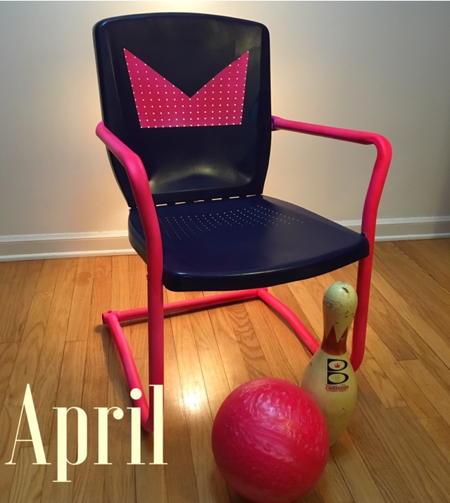
When I first saw this Arvin metal lawn chair, its perforated back and seat formation resonated with me as crowns. I saw the chair as a princess. But as I applied bright, mid-century paint colors, it felt more like a bowling alley, the chair’s back “crown” so similar to the crisp, 1950’s and 60’s Brunswick crown. I was no longer going to a ball—I was taking my ball and hitting the lanes!

*  *  *


Name: The Brunswick

Artistic Restoration: Fall 2017

Manufacturer: Arvin

Period: 1950s


The artist, the chair


A shout out to Don Storer at Midcenturymetalchairs.com for his ongoing research assistance.

Continue to follow The Metal Lawn Chair of the Month at AVintageChick.com

C R Kennedy


March – Metal Chair of the Month

Perennial of Spring

You are not your reflection

The mirror tells its own tale

A deceitful attempt to capture your attention

And hold it, distracting you from your inner elegance which it cannot display


Resist the seduction of the flower

The slightest embrace will crush it

Its beauty is short-lived, fleeting

The perennial of spring folds in spring, no other season accommodates its being

“Echo and Narcissus,” a painting by John William Waterhouse, 1903


Oh, dear Narcissus, look away…

Gaze upon my face instead

See your loveliness in my eyes

Where you will flourish eternally,

          reprieved from the heat of the sun,

shielded from falling leaves,

ensconced against the bitter cold of night

C R Kennedy

The daffodil, of the genus Narcissus

In classical mythology, Ovid tells the tale of Narcissus, the son of the river god Cephissus and the nymph Liriope. Narcissus was warned by his parents that he would live a long life only if he did not look at himself. Although many nymphs and women fell in love with him, he rejected them all. The mountain nymph Echo, who had been cursed by the goddess Juno to only repeat the last words she heard, was devastated by Narcissus’ rejection. She withdrew from life and faded away until she was no more than a literal echo. Nemesis (as an aspect of Aphrodite), the goddess of revenge, learned of this story and decided to punish Narcissus. She lured him to a pool where he saw his own reflection. Not realizing it was only an image, he fell in love with it, and when he determined that love could not be reciprocated, he committed suicide. A Narcissus flower grew on the spot where he died.

*   *   *


Name: Narcissus and Reflection

Artistic Restoration: Summer 2015

Manufacturer: Shott – Balcrank

Period: 1940s – 1960s


The artist, the chairs.


A shout out to Don Storer at Midcenturymetalchairs.com for his ongoing research assistance.

Continue to follow The Metal Lawn Chair of the Month at AVintageChick.com

C R Kennedy

February – Metal Lawn Chair of the Month

Sweetheart Chair


I remember the nights

On the porch

With my Sweetheart

Warm summer breezes

Crisp autumn chills

While we sat

Content


Separation…

I’d transformed to a level of refinement

Not intended for the winter

Too pristine for the cold…snow…ice

But my Sweetheart remained rugged


He endured, I hibernated

He watched, I slept

He stayed on the porch, for years, hanging with the generic, the dull, the riffraff…

I hobnobbed in luxury with elitists, the bright, the shiny, the privileged…


But on the day for sweethearts, I remember my Sweetheart,

And the distance, though not far, is laid out with seemingly impenetrable walls

For, though identical beneath the surface, and in style,

Experience has separated us…and class and attitude and mantras…

Shallow labels that keep Sweethearts in their place

And not side-by-side, lingering in the night, on the porch

There’s a rumor floating around the metal lawn chair community that this chair was once called “Sweetheart Chair” in an advertisement. The evidence, however, is currently lost in the deep, dark, depths of the Internet. Or maybe in a yellowing magazine in the cobwebby archives of a library. But I like the name. Not simply because it’s February—the month for sweethearts—or because this chair of mine is finished. And pink. No, it’s because this particular chair has a sweetheart.

I found this metal lawn chair in a flea market, all alone. This market was the same place I found most of my chairs in the early days, and at reasonable prices. However, this chair was double the price of anything I’d ever seen there. Problem was, I was pretty green in those days and had never seen anything like it. Unique. Lovely. Feminine. She spoke to me. “Save, me,” she said. With all the makings of a damsel in distress, she sat outside in the chilly spring air, amongst the junk, next to a busy road, at the filthy flea market. So, I slayed the dragon (coughed up the cash), threw her over my steed (squeezed her into my Taurus), and carried her away to my castle (my quaint Cape Cod).

That same day, in her rusty and weathered condition, I decided to show her off. There were many suggestions regarding how to redress her, interpretations of her authentic style, and a few admirers already asking for a spot on her dance card. Yes, a photograph friend wanted to buy her “as is” to be used as a prop. But this Eliza Doolittle was no prop… She was meant to be enjoyed and loved, not admired from afar.

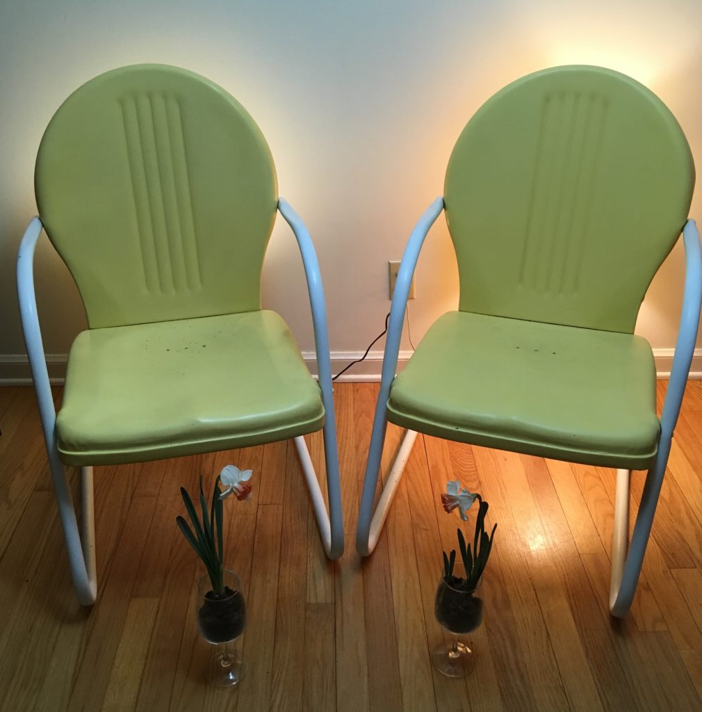
The resonating comments claimed the scrolls on her seat back (filigree) resembled seahorses, and the waves along the top mirrored a clam shell. After considering these remarks, my community of metal lawn chair fans thought pink was the obvious color choice—like a pink sea shell. With my eccentric, mid-century brain flooded with images of “surf” and “pink,” it took a leap to this:

Yeah. A 1940s/50s pink and “Ming Green” bathroom.

The passionate chore of sanding away rust and smoothing layers of paint filled my summer afternoons and evenings. But I spent my mornings commuting to my accounting job. On one of those mornings, I spied a potential companion for my Sweetheart Chair. He sat on a driveway next to the garage door, just off the busy street I traveled twice a day. Surrounded by a handful of white, plastic chairs and decked in primer gray, this Sweetheart Chair didn’t fit his environment. Several times I considered stopping at the house, offering the owners up to $50 for the chair. But I was a little worried I’d make them angry—insult them somehow. And a little worried they’d think I was crazy—who does that sort of thing? So, I hesitated. Everyday the chair stared me down as I drove by, and everyday something about it just didn’t feel right.

August rolled around, and I found myself in Wisconsin, Milwaukee to be specific. Just walking down the street… Literally! Out of nowhere, I bumped into him, perched outside a storefront, out of place and out of time. A little worn, a little bent-out-of-shape, the chair remained young for his age. Most important, this Sweetheart was without a mate. Did he have any idea a future beauty resided in Kansas, dreaming of a partner? Maybe so, because he was priced to move—the least expensive metal lawn chair I’ve ever found. No dragon to slay this time, I tossed my coins on the counter, loaded him up, and proceeded to cart him across four state borders.

They sat side-by-side on the back porch for awhile, only separated when I took her into the grass to continue prepping and painting her. But winter came. And she was too pretty to leave exposed to the elements. I brought her inside so she could hang with the other pristine chairs in the warm, dry basement. He remained on the porch, with the pedestrian and unfinished chairs. And I forgot they were apart, until today. But uniting the two requires one of them to change. I don’t know how this story will end.

What does it feel like to yearn for your Sweetheart? I know the sadness well. It’s an old friend, who lingers on my porch, long into the night.

 * * *

The artist, the chair.

Name: Sweetheart Chair

Artistic Restoration: Summer 2016

Manufacturer: Sun Radiator Company or Bunting

Period: Pre WWII 1940s


A shout out to Don Storer at Midcenturymetalchairs.com for his continued research assistance.

Continue to follow The Metal Lawn Chair of the Month at AVintageChick.com

C R Kennedy


The Mid-Century Clock: What Every Mid-Century Modern Enthusiast Should Know and Love

The first Starburst Clock I acquired: an Elgin, most likely produced in America.
An awesome Christmas gift.

My favorite quote is about a cuckoo clock. Only, it’s not so much about a clock. It’s more about history and climate and culture. And art. And tyrants. This quote pits oppressive virtuosity against contented mediocrity. Stolen from a combative American painter, these lines were re-crafted by an innovative actor, director, and writer with the sole purpose of filling an extra seventeen seconds of screen time. Given all that complexity, it’s fascinating Orson Welles’ unscripted, romanticized dialog in the 1949 British film, The Third Man, has become known simply as the “Cuckoo Clock Speech.”

“You know what the fellow said – in Italy, for 30 years under the Borgias, they had warfare, terror, murder and bloodshed, but they produced MichelangeloLeonardo da Vinci and the Renaissance. In Switzerland, they had brotherly love, they had five hundred years of democracy and peace – and what did that produce? The cuckoo clock.”

Breaking it down to specifics, this speech has more holes than Swiss Cheese, and has been ripped apart by historians, artists, intellectuals, and general know-it-alls, with the most argued points being:

  • The House of Borgia was prominent during the Renaissance, not preceding it
  • The Borgias reigned concurrent to the careers of Michelangelo and Leonardo da Vinci, not before. The Borgias were actually patrons of Michelangelo, while Leonardo was patronized by their arch-enemies, the Medici
  • While the Borgias flourished in Italy, Switzerland had “the most powerful and feared military force in Europe” and was not the peacefully neutral country it would later become, in the mid-eighteen hundreds
  • The Cuckoo Clock was invented in the Black of Forest of Bavaria (Germany) sometime in the seventeenth century, not in Switzerland
  • Not much came out of Switzerland during the Renaissance Era because the country was isolated and poor, with thin mountain soil and a bad climate

Despite all those pesky, nitpicky facts, I find the overall theme of Welles’ speech to be spot on. I believe after times of destitution, turmoil, atrocity, and warfare, there is a rebirth, or even explosion, of art. And its mood—pessimistic, optimistic, or, God-forbid, neutral—is irrelevant, especially if said art is in the form of say…a Cuckoo Clock. Or, if you happen to be a mid-century modern nut and prefer your clocks to burst from the center without the aid of a startling, wooden birdie.

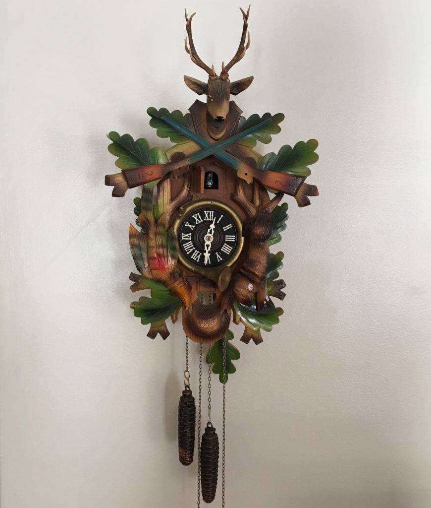
My grandmother’s mid-century Cuckoo Clock.
A gift from my dad, straight from the Black Forest.

In the mid-1960s, my dad guarded the Berlin wall while stationed in Germany with the U.S. Army. A time of peace in the United States, I can only imagine the ongoing turmoil in East Berlin as people continued the difficult and blockaded process of recovering from a destructive war and ongoing oppression. Despite the strife he witnessed on the other side of the wall, my father returned to Kansas with a handful of souvenirs from his ancestral homeland: a small collection of Cuckoo Clocks. One he kept for himself and his future family, one he gave to his mother, and, we believe, he passed on a couple to his sisters.

I have the one he gave his mother, which hung on her living room wall for the remaining duration of her life—about forty years. Made in the mid-century and fashioned from wood, metal gears, cast iron pine cone weights, and a carved maple leave pendulum, this clock has, in effect, the exact same function as its stylistically modern cousins: to keep time.

Fifteen years before my dad snagged his German treasures, an archetype, mid-century modern clock design sprung from the minds at Nelson Associates in New York City, a thriving American metropolis never to be confused with Switzerland or the Black Forest. George Nelson’s company designed for the Howard Miller Clock Company beginning in 1947. The story of their first success in George Nelson’s words:

“And there was one night when the ball clock got developed, which was one of the really funny evenings. Noguchi came by, and Bucky Fuller came by. I’d been seeing a lot of Bucky those days, and here was Irving and here was I, and Noguchi, who can’t keep his hands off anything, you know—it is a marvelous, itchy thing he’s got—he saw we were working on clocks and he started making doodles. Then Bucky sort of brushed Isamu aside. He said, ‘This is a good way to do a clock,’ and he made some utterly absurd thing. Everybody was taking a crack at this, pushing each other aside and making scribbles.

An original George Nelson Ball Clock.
No one has gifted this to me yet (hint, hint…).

At some point we left—we were suddenly all tired, and we’d had a little bit too much to drink—and the next morning I came back, and here was this roll (of drafting paper), and Irving and I looked at it, and somewhere in this roll there was a ball clock. I don’t know to this day who cooked it up. I know it wasn’t me. It might have been Irving, but he didn’t think so…(we) both guessed that Isamu had probably done it because (he) has a genius for doing two stupid things and making something extraordinary…out of the combination…. (or) it could have been an additive thing, but, anyway, we never knew.”

Given Mr. Nelson’s story, it’s up for debate if their initial clock grew out of warfare or brotherly love (using Orson Wells’ terms). Launched in 1948, the Ball Clock picked up the name “Atomic” because it resembled the structure of an atom. Perhaps not a coincidence, its inception corresponded with the infancy the Atomic Era in design.

Evolution pushed the Ball Clock toward arguably the most iconic clock design of the modernism movement, the Sunburst, or Starburst Clock. Much more versatile in interpretation than the Ball Clock, this new design was conceived in 1949 by Nelson Associates for Howard Miller. However, this new concept literally burst into an array of materials, complexities, and compositions by designers and manufactures around the world.

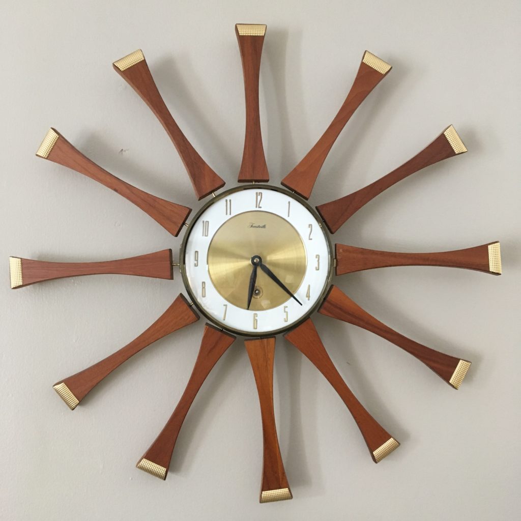
A mid-century Forestville, Starburst Clock.
I picked this up as a birthday gift for a dear friend,
but now I’m having second thoughts.

This last Thanksgiving, I picked up my second Starburst Clock. I was naïve enough to ask the check-out clerk at the antique mall if it worked, or if they had a battery we could test it with. He and I both examined how the movement was attached with itty-bitty screws to the back of the clock and gave in to the obvious hassle. I purchased as is, telling myself it could surely be repaired it necessary. The next day, after a bit of research, I realized it was a wind-up clock (so that’s what the funny looking hole on the face of the clock was for…). I didn’t have a winding key, and during my investigation the glass door covering the face came unhinged, so my next stop with the clock was the neighborhood jewelry shop.

When I retrieved the clock a week later, my enthusiasm for mid-century modern design was perhaps a bit over-the-top. The clock guy saw an opportunity and asked me to follow him to the back of the shop. What sat on a dusty shelf in a dark hall by the back door caused me to gasp. After he’d satisfied himself that it kept near accurate time, I bought yet another mid-century clock, this one at a bargain price.

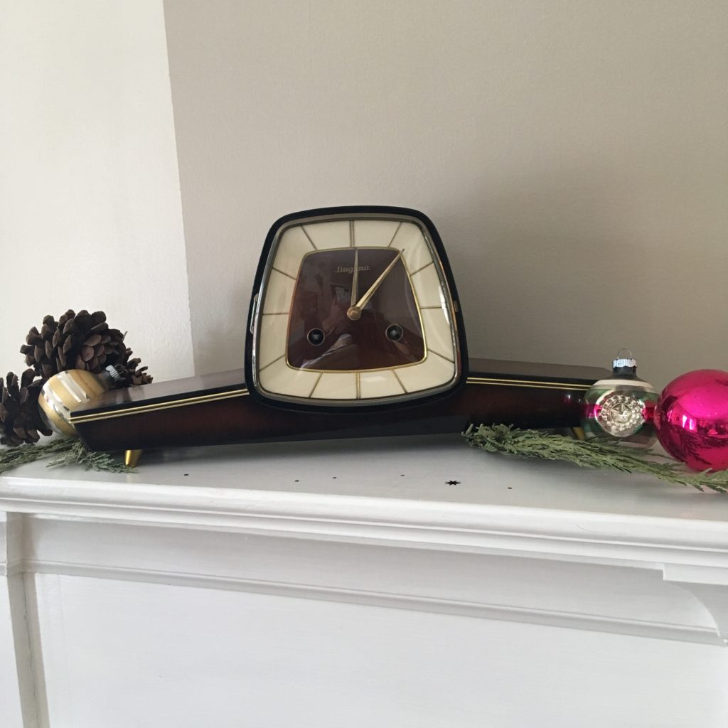
Dugena is a German company that bought clocks and sold them under their own name, much like a department store brand. They re-branded this particular clock which was made by Hermle, a Black Forest clock maker that rose from the ashes in Germany in 1922, shortly after WWI. Surviving the depression and the devastations of WWII, Hermle went on to thrive in the mid-century and is still going strong today, manufacturing a wide variety of clocks, movements, pendulums and dials. Not unlike a twentieth-century Michelangelo, raising from “warfare, terror, murder, and bloodshed.”

A 1965 Dugena (Hermle) mantle clock.
Modern with an Art Deco twist, this one I gifted to myself.

George Nelson, a student of architecture and an accomplished designer and writer, lent himself to a modern-day Leonardo de Vinci. Howard Miller, who put his stamp of approval on every clock Nelson’s team designed, was trained in the art and science of clock making by his father, Herman Miller, in the German Black Forest. While crafting his profound dialog, was Wells actually considering his contemporaries—modern day artists and patrons whose legacies carried on into our current century?

Historians may be satisfied with the Cuckoo Clock speech “holes” listed above, but artists, aficionados, and mid-century modern enthusiasts should demand an addendum. Although “every day” and functionally necessary in our modern world, a clock can’t be mocked for lacking significant artistic value. Considering that some of Nelson’s original clocks sold under the Miller brand are currently listed on online auction sites for thousands of dollars, it’s fair to say these objects are sought-out treasures.

Designed in America after many years of depression and warfare, and approved and marketed by a Black Forest trained patron, the modern Ball and Starburst Clocks united post oppression artistry with the true home of the Cuckoo Clock. That’s a well-crafted, lucrative twist of “brotherly love” even the Swiss would envy.

Sources:

Reddit: Ask Historians. Web. 23 Jan 2018.

https://www.reddit.com/r/AskHistorians/comments/130cv5/is_the_cuckoo_clock_speech_given_by_orson_welles/

“House of Borgia”. Wikipedia. N.p.,n.d. Web. 23 Jan 2018.

https://en.wikipedia.org/wiki/House_of_Borgia

“George Nelson (1908-1986), USA Biography and More”. N.p.,n.d. Web. 23 Jan 2018.

http://www.georgenelson.org/georgenelsonbiography.html

Joiner, Ronald. “Dugena Mantel Clock Revisited”. Antique and Vintage Clock Collecting and Repair. Web. 23 Jan 2018.

https://ronaldjoiner.wordpress.com/2017/05/07/revisiting-my-dugena-mantel-clock-yet-again-as-yogi-berra-would-have-said/

Oliver, Richard. “Franz Hermele Clock Company History”. Antique Clocks Guy. Web. 23 Jan 2018.

http://www.clockguy.com/SiteRelated/SitePages/ContactUs.html


January – Metal Lawn Chair of the Month

IMG_1666 (3)

January’s Chair – “The Empire State Building”

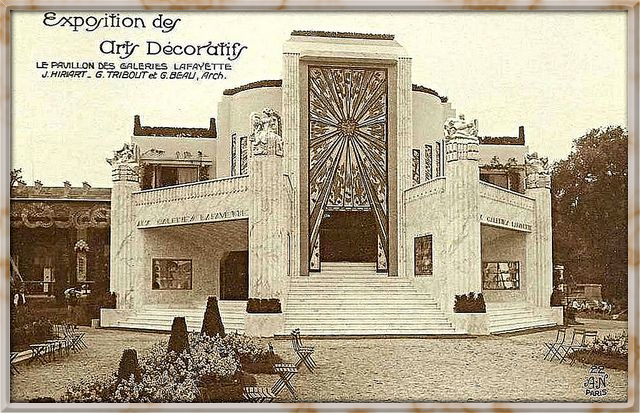
1925 Paris Exposition Internationale - Le Pavillon Des Galeries with a rich Art Deco facade.

1925 Paris Exposition Internationale – Le Pavillon Des Galeries with a rich Art Deco facade.

Parisian by birth, Art Deco burst onto the scene at the 1925 Exposition Internationale. He grew strong and tall, influenced by African culture, Picasso, and Bauhaus. Ridged, bold, fierce, angular…he soared to new heights, forged new industrial frontiers, and cast away the clutter of the past. Yet the architectural and design gods realized Art Deco needed a companion, so they stole an element from his being, softened it, rounded it…crafted it feminine.

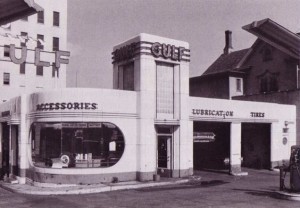
Streamline Moderne possessed the sophistication of Art Deco, and the intellect, but she danced with curves and seduced with movement. Long, slender lines. Aerodynamic grace. She was truly the face that launched a thousand ships.

Gulf Filling Station in glorious Streamline Moderne.

Their youthful days were long and industrious, their nights a jazzy, café society romp. But the tides turned, and they came-of-age in the harshest of realities. The two intertwined and clung tight during the depression and the war, abandoned by their gods, sudden slaves to efficiency, practicality, and necessity.

When the dust settled and peace reigned, when breaths could sustain…linger…expand…they bore a love child, and cradled him in freedom and enthusiasm and American capitalism. He grew to be clean-lined, futuristic, and all-kinds-of “matic.” He thrived in optimism, lit the night sky with starbursts, and took the name Mid-Century Modern. And the gods were pleased.

* * *

When I found the chair. Dull, flat white paint and bits of rust.

When I found the chair. Dull, flat white paint and bits of rust.

This metal lawn chair was made by the Arvin Furniture Company in the 1940s. When I acquired it, the chair had been repainted from its factory finish in a flat, dull white. But the groves in the metal—the long, arched, lean lines—spoke to me instantly. They said, “Art Deco.” They said, “Empire State Building.” Later, the subtle lines on the side announced themselves as “Streamline Moderne,” and I realized my Empire State Building chair was fluid, not only a testament of the greatness of its own era, but a foreshadowing of exciting things to come.

* * *


Name:                                     “Empire State Building” Chair

Artistic Restoration:         Summer 2016

Manufacturer:                      Arvin Furniture Company

Product name:                     Style 27 Chair

Period:                                    1940s

The artist, the chair

The artist, the chair.


Continue to follow The Metal Lawn Chair of the Month at A Vintage Chick.com

C R Kennedy


Sources:

Chandler, Arthur. “The Art Deco Expositon”. Web. N.p.,n.d. 7 Jan 2018.

http://www.arthurchandler.com/1925-art-deco-exposition/


A Case for the Atomic Christmas Stocking: What Every Mid-Century Modern Enthusiast Should Know and Love

For the children who became known as the baby boomer generation… During civil defense drills, while you were curled up in a ball under your school desk, did you ever consider that Santa was watching?

The fear in her eyes puts tears in mine.

The fear in her eyes puts tears in mine.

As a kid I was never once instructed on how to “duck and cover” under my school desk. I guess at that point in the Cold War, during the 1970s and 80s, America’s fears had thawed regarding a nuclear weapon being launched by Soviet Russia. Or more likely, educators and the Civil Defense Administration were in a new position, caught somewhere between the perceived ridiculousness of the practice and the political fashion of the day.

Even as early as the late 1960s, America’s fears and fascinations with all things atomic had decayed. The mid-century lust for conquering space by progressing science, which went so far as to bring representations of starbursts, parabolas, and atomic symbols into our newly constructed, suburban tract homes, also fell out of fashion. This period of history, which began in 1945 with the detonation of the first nuclear bomb, became known as the Atomic Era. By 1965 its lure had peaked and was rapidly cooling.

A few months ago I realized I needed a couple Christmas stockings at my 1953 Cape Cod home, and, of course, only mid-century stockings would do. I hoped there were still a few still hanging around from the 1950s that screamed “Atomic Era.” I scoured eBay and the Internet—surely the supreme coolness and innovation of the mid-century aluminum Christmas tree spilled over into other decorative traditions of a mid-century Christmas celebration.

Apparently it hadn’t. I found nothing that satisfied my atomic craving. My enthusiasm briefly went cold, much like a hard lump of coal. Once again, I was forced to revert to what has become a perennial Plan B in my life: if you can’t find what you want, create it.

But how do you craft a nostalgic representation of something that never existed? Was it even possible? A bit of research and several attempts at the drawing board finally took me there, and I began with a visitation of why the atomic era was so “atomic.”

“Atoms for Peace” was the title of a speech delivered by President Dwight D. Eisenhower on December 8, 1953. He was addressing the UN General Assembly in New York City as part of the media campaign called “Operation Candor.” The idea, arguably propaganda, was to enlighten the American public on the risks and hopes of a nuclear future.

At first glance, I was shocked by the idea that atomic fission should be consecrated.

At first glance, I was shocked by the idea that atomic fission should be consecrated.

Not only were early Cold War Americans fearful of the Russians dropping the bomb on us, but also of what our own government might do with its powerful arsenal of nuclear weapons. Eisenhower’s plan was not only to manage the emotions of the America public but to evoke the containment strategy against Russia—to stop the expansion of communism. The scenario reminds me of Uncle Ben’s often-quoted line to Peter Parker in the Spider-Man movie: “With great power comes great responsibility.”

Eisenhower hoped to squelch national fears and reassure its citizens of a scientifically progressive yet militarily level-headed U.S. government. Atomic energy—the result of nuclear fission—was to be used for good, not evil. Convincing the Russians to do the same was an obvious diplomatic mission. Sustainability of the human race and any chance for lasting peace depended on it.

Mid-century design for peace…The preoccupation and alarm of atomic energy and its manifestations drove the post-war culture, but not only to build fallout shelters and practice air raid drills. In a mid-century paradox, the atomic symbol and its scientific cousins wove themselves aesthetically into the period’s design, often found in architecture, automobiles, and perhaps more abundantly, interior design.

After splitting the atom and winning a world war, America’s confidence rode high, and we were enthusiastic to conquer space. We stamped that fervor into entertainment, children’s toys, and the basic elements of our lives—the simple yet essential components of our homes. Mathematic and scientific representations such as parabolas, starbursts, and amoebas were incorporated into the look and construction of interior design enhancing futuristic and progressive flare.

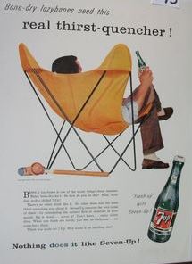
The atomic symbol fit neatly into the evolving mid-century style, easily found in the form of wall clocks and light fixtures, and less obviously in the slender, arching, metal legs on tables and chairs. Those thin geometric lines, appropriately known as a “sensitive line,” gave furniture the appearance of gravity defiance.

Seven-Up ad featuring the Butterfly chair. The sensitive lines (the chair’s metal legs) resemble the atomic symbol.

Seven-Up ad featuring the Butterfly chair. The sensitive lines (the chair’s metal legs) resemble the atomic symbol.

According to Thomas Hine in Populuxe, the theme for the period was dynamism and fragmentation. The scientific, industrial, artistic, and economic systems exploded in post-war America. As a result, people moved out from the city core and created their own small sanctuaries in the suburbs. Bringing symbols of the atom into these new homes—their isolated space for refuge and peace—seems a contradiction. To lounge in a chair with atomic shaped legs and glance at your atomic clock, while only mere feet from your bomb shelter—an arguable necessity due to fears of atomic weaponry—is a fascinating mid-century paradox.

Santa for peace…A sleek, linear Santa Claus made a bold appearance in atomic era design. He jetted across Christmas cards in rockets and spacecraft, propelling American faith that we could get there, too. He carried his traditional optimism in the modern craft of his choice, and still toted an array of presents, even though the American landscape for materialism had vastly changed.

By the 1950s he was firmly established in American culture and acting as a convenient conduit for the exploding post-war phenomena of consumerism. Could there ever be a better advertising spokesman for frivolous consumption than Santa? The era of economic boom, mass production, and constant upgrades for progress used Santa as a well-suited vehicle to promotion and push products out of the suburban retail stores and under the manufactured aluminum Christmas tree.

Santa was all over the scene in mid-century America—appearing in pre-holiday parades, on Christmas cards, in newspaper advertising inserts, on mugs filled with hot chocolate, in seasonal yard art…not to mention in department stores, where Santa could cleverly ask an innocent child what he or she desired as a Christmas gift. How often was that object within proximity of Mommy and conveniently located near a cash register?

A three-year-old on Santa’s lap in a Virginia Department store, circa 1961.
The child appears to be a bit fearful as to his status regarding The Naughty and Nice List.

This cynical view of Santa is merely a portion of his complex and long career. His rich history includes fourteenth-century accounts of teachers dressing as St. Nicholas on December 6th and using a birch rod to beat the children who failed academically that year, while rewarding successful children with sweets or pocket money.

A much kinder mid-twentieth century Santa continued to analyze the behavior and enforce discipline upon children. The 1934 song, “Santa Claus is Coming to Town,” enjoyed its most popular versions in 1951 recorded by Perry Como and 1953 by Gene Autry. Listeners were reminded: “He’s making a list and checking it twice, Gonna find out who’s naughty and nice.”

Santa’s mid-century career mirrors that of another 1950’s global power and icon, if you will. He’s acting much like Eisenhower, who hoped to advance industry, keep the peace, and promote responsibility. Santa, similarly, is balancing the desires to produce and distribute material goods with the need to keep people, mostly little people, accountable for their actions.

Santa had a lot to juggle in post-war America.

Believing for peace… Last week my fourteen-year-old daughter nervously approached me and told me she had something important to tell me. Several scenarios quickly ran through my head, none of them comfortable conversation topics. But what she professed I had long been ready to combat, with a reply that was sincere in my heart and ironclad. She wanted me to know that she knew Santa wasn’t real, and I didn’t have to get her any gifts from Santa. I sensed her confession was less out of blossoming maturity, and more from economic concerns—she wanted to save her mother a buck. I appreciated that.

No way is this beautiful two-year-old going to grow up and stop believing in Santa.

No way is this beautiful two-year-old going to grow up and stop believing in Santa.

Unfazed, I held firm to my position. My response had nothing to do with me trying to cling to my baby’s innocence and everything to do with a ridged personal stance. I didn’t hesitate to tell her I still believed in Santa, and my advice to her was to never stop believing. She probably internally rolled her eyes at me, but I hope I at least planted a seed in her strong-willed mind.

I really do believe in Santa Claus. For all that Santa has represented over the centuries, to me his strongest attribute is the sense of hope and calm he casts during what has become a frantic and stressful season. Santa grounds us in the foundation of Christmas, in charity and sacrifice, which is the pure definition of love.

So Santa Claus, an undeniable mid-century icon, became the foundation for my atomic stocking. Many of the images of him from the era, mostly on Christmas cards, depict him holding up a tall stack of wrapped packages. It’s as if during that time in history he was considered to be carrying a heavy load.

Mid-century Santa Christmas card

Mid-century Santa Christmas card

As my mind struggled with exactly what Santa should be doing, and debated if holding up packages had any mid-century significance, those packages began to weightlessly swirl over his head, as if he were juggling them. Perhaps they simply defied gravity.

Although I couldn’t find the perfect stocking on eBay, I did manage to score McCall’s stocking pattern #2271 from 1958, which I think lent authenticity to the cut of mine. Besides Santa and his inventory of presents, I also mixed into my design period-appropriate motifs and a handful of mid-century colors, including pink, gray, and sky blue. If I can get the back of the stocking sewed on before Christmas Eve, Santa and I can continue our long-standing contractual agreement.

I don’t know how many times the little boy from Virginia pictured above had to “duck and cover” under his school desk, but I’m pretty sure he never hung a Christmas stocking with sensitive lines depicting the atomic symbol or which fashioned an inscription of his name. Somewhere in his youth, however, he perfected the talent of comedic timing, as he told me this joke as I was wrapping up this blog. Why should you never trust atoms? Because they make up everything. Apparently they do make up everything, even contemporary depictions of non-existent, mid-century, atomic Christmas stockings.

Promoting economic expansion through consumerism while incentivizing scientific responsibility in our world leaders is a big job, but leave it to Santa Claus to juggle it effortlessly.


Sources:

“Atoms for Peace”. Wikipedia. N.p.,n.d. Web. 22 Dec 2016.

<https://en.wikipedia.org/wiki/Atoms_for_Peace>

Moxie, M. “Atomic Age Design: Beauty and the Bomb”. Retropedia: A Look at Style and Design Through Time. 23 Jan 2013. Web. December 2016.

Philpott, Sarah. “St Nicholas: Naughty or Nice?”. The History Vault. N.p.,n.d. Web. 22 Dec 2016.

<http://www.thehistoryvault.co.uk/st-nicholas-naughty-or-nice/>

<http://revivalvintagestudio.blogspot.com/2013/01/mid-century-design-in-atomic-age-beauty.html>

Hine, Thomas. Populuxe. Alfred A. Knopf, Publisher. 1986.