“I believe that truth has only one face: that of a violent contradiction.”
~ Georges Bataille, twentieth century French intellectual and writer
“The purpose of contradiction in art is to exaggerate the extremes and force them to pop against each other. If done well, balance and harmony are achieved in the eye of the beholder. However, if the beholder is a blogger with the intention of explaining said art, it becomes an exercise in frustration and procrastination—a violent maddening of the mind.”
~ C R Kennedy, mid-century enthusiast and blogger
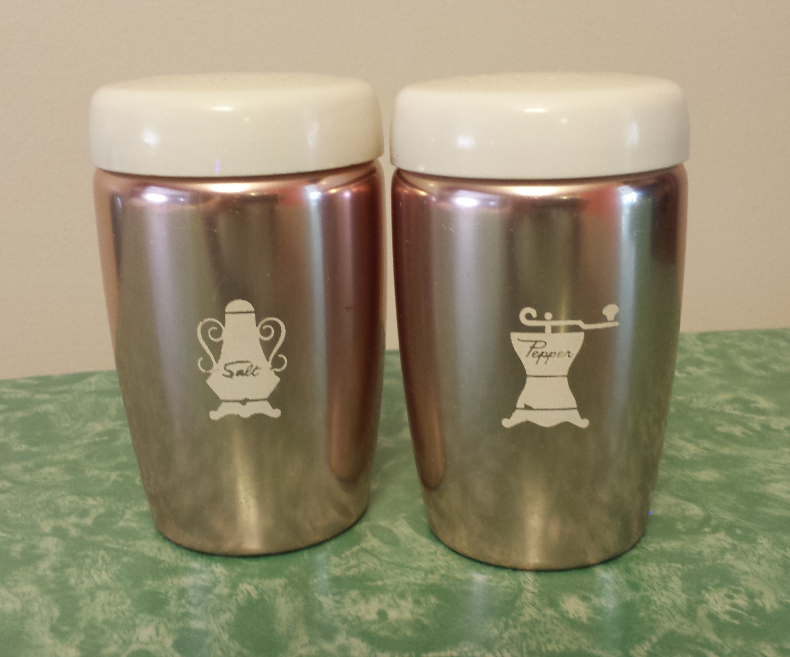
Aren’t they an adorable couple? I’ve decided to name this West Bend Pantry Ware salt and pepper shaker set Betty and Don Draper, after two of the leading characters from the TV drama, Mad Men. Your first thought may be “oh…because the pair is mid-century and Betty Draper is blonde (salt) whereas Don has thick, dark hair (pepper).” That analogy would work, but my reasoning is far less obvious. I arrived at those well-suited names after a Sunday morning epiphany, brought about by an intense examination of a sharp contradiction. Here’s what led to that revelation:
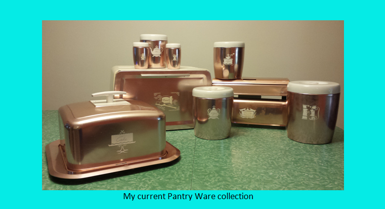
I recently bought this West Bend Pantry Ware salt and pepper set from an eBay auction for $22.50. In 1959, the two pieces above—along with a matching grease container—were known as “the range set” and retailed for about $3.95. My intentions regarding this purchase were to nearly complete the Pantry Ware line my grandmother had, which I inherited in 2003. Last fall I added the matching breadbox—another eBay find—for $20.
Even though there are no dates stamped into their copper-colored, anodized aluminum construction, I had always been comfortable this set was mid-century. Simply, it looks very 1950s/60s and most of the items in my grandmother’s kitchen originated from that period. But I had no solid evidence. And although I so badly wanted to label these items “modern”—their shiny, clean, solid colored, linear, highly functional construction screams “modern”—the cute little Colonial labels threw me. Why the heck did West Bend slap Early American art on a sleek, modern-styled kitchen accessory? It made me crazy.
This line is abundant on eBay, and also came in polished aluminum with black accents, and copper-colored bases with black accents. But I am yet to see a seller putting an exact date of production in the description or giving the line a name.
I hoped researching the vast history of West Bend—a hundred-year-old manufacturer of many products—would shed some light on the age and style of my kitchen accessories. After a fire destroyed a pocketbook manufacturing company in West Bend, Wisconsin in 1911, a young and dynamic local entrepreneur, Bernhardt C. Ziegler, recruited six other men to help him incorporate the West Bend Aluminum Company. With Sears, Roebuck and Company as an early anchor customer, by 1921 West Bend earned the rank of third in the nation in sales of aluminum cookware. During WWII over 300 new items were manufactured through defense contracts, earning the company six Navy “E” awards for outstanding achievement. Post war production included an air-cooled out-board motor marketed exclusively through Sears under the “Elgin” name, a division later purchased by Chrysler. Many innovative and successful mid-century fabrications are mentioned in the company history, but not the polished aluminum or copper-color kitchen accessories.
Somewhere, deep in the depths of a Google search, I finally found a Pinterest link that took me to an image of a 1957 West Bend advertising insert (shown below). A juicy little nugget of information appeared at the top of the beautifully illustrated ad—“Pantry Ware.” Those two words opened a door, and I found a handful of magazine and newspaper ads for Pantry Ware, fortunately with dates and retail prices. Finally, solid evidence that these pieces are mid-century.
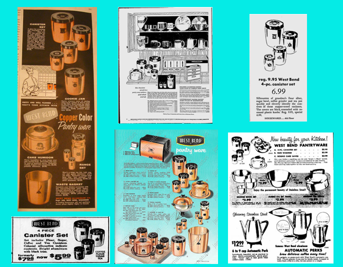

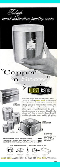
It appears by 1955 production of the Pantry Ware line was in full swing, as the oldest advertisement above was in a magazine of that year. The first style of this line was in aluminum or anodized copper with black lids and labels. Their nickname in a few ads was “Bright ’n Black”. I believe it wasn’t until 1959 that white lids and graphics were introduced on the copper anodized pieces which were given the nickname “copper ’n snow”.
![]()
Onto my second quandary; is this line modern, or instead, a fun Colonial throwback? Oddly, this is where Don and Betty Draper come into play.
During the mid-20th century, two very drastic decorating styles competed for prominence in the American home: modern and Colonial, which is sometimes more specifically broken down into Colonial and Early American. A stylish mid-century home would have been considered eclectic, albeit quite normal, to have elements of both modern and colonial (contemporary and traditional) sprinkled about.
A fantastic example of these extremes is well-illustrated in the early seasons of Mad Men.

Betty Draper’s kitchen, in my opinion, is a great example of mid-century Colonial design: knotty pine wood cabinets; muted, brown patterned wallpaper; frilly, busy curtains; and an Early American pine kitchen table. Behind Don hangs a wood spoon rack. Her oven is in a greenish earth tone. The room is warm and cozy, homey in the tradition sense.
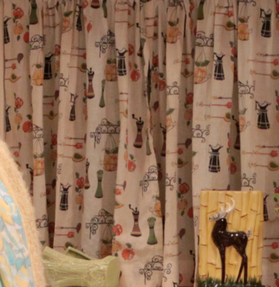
A close-up of Betty’s kitchen café curtains shows Early American images, much like the images on the Pantry Ware. Check out the brown pepper grinder.
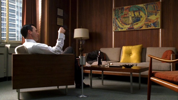
Don’s office, on the other hand, is the height of modern style. There are several strong, silver metallic, vertical lines—dividing the wall paneling, used as chair and table legs, and holding up Don’s ash tray. Even the paneling—perhaps walnut—has a linear, vertical pattern. The furniture has strong, straight edges. All fabrics are solid colors, and the yellow sofa pillow is bold, square, and shiny—I believe its purpose is to draw the eye to the bright, abstract painting above. The room is crisp, clean, uncluttered, yet very stylish—everything we love about modern.
Both styles played a dominate role in Don’s life at the same time. They complement each other to the extent their presence allows you to see exactly what the other style is not.
Given the examples of innovativeness, success, and longevity of West Bend’s products, I wonder if the contrasting styles regarding the Pantry Ware were an attempt to market these products to both sectors of the buying public—those seeking the spark and boldness of modern style, and those longing for the comfort and hominess of traditional Colonial.
At the end of the day, the best validation for labeling these products as modern comes directly from the manufacturer. On the company’s 1957 advertising insert (shown above), which beautifully displays the entire line of copper and black items, we find the following description: “Strikingly modern – with a touch of Early American charm. That’s the beauty of West Bend’s complete line of perfectly matched Pantry Ware. Protective coating prevents fingerprinting, keeps every piece bright and new-looking. Sparkling polished aluminum or tarnish proof copper-color aluminum.”
I’m satisfied that these beautiful, mid-century pieces are modern, but personally, I prefer my Don Draper pepper shaker analogy. What can I say? I’m a sucker for sleek, bold, and handsome.
Sources:
“West Bend Co. History.” Funding Universe. N.p., n.d. Web. 18 Oct. 2015.
<http://www.fundinguniverse.com/company-histories/west-bend-co-history/>.
Source: International Directory of Company Histories, Vol. 14. St. James Press, 1996
“Colonial & Traditional Style: 20th Century Interior Design.” [Antique Home Style]. N.p.,
n.d. Web. 18 Oct. 2015. <http://www.antiquehomestyle.com/inside/colonial/>.
I do not possess copyrights to the newspaper or magazine advertisements or the Mad Men photos. They belong to their original owners.
the same page layout and design. Wonderful choice of colors!|